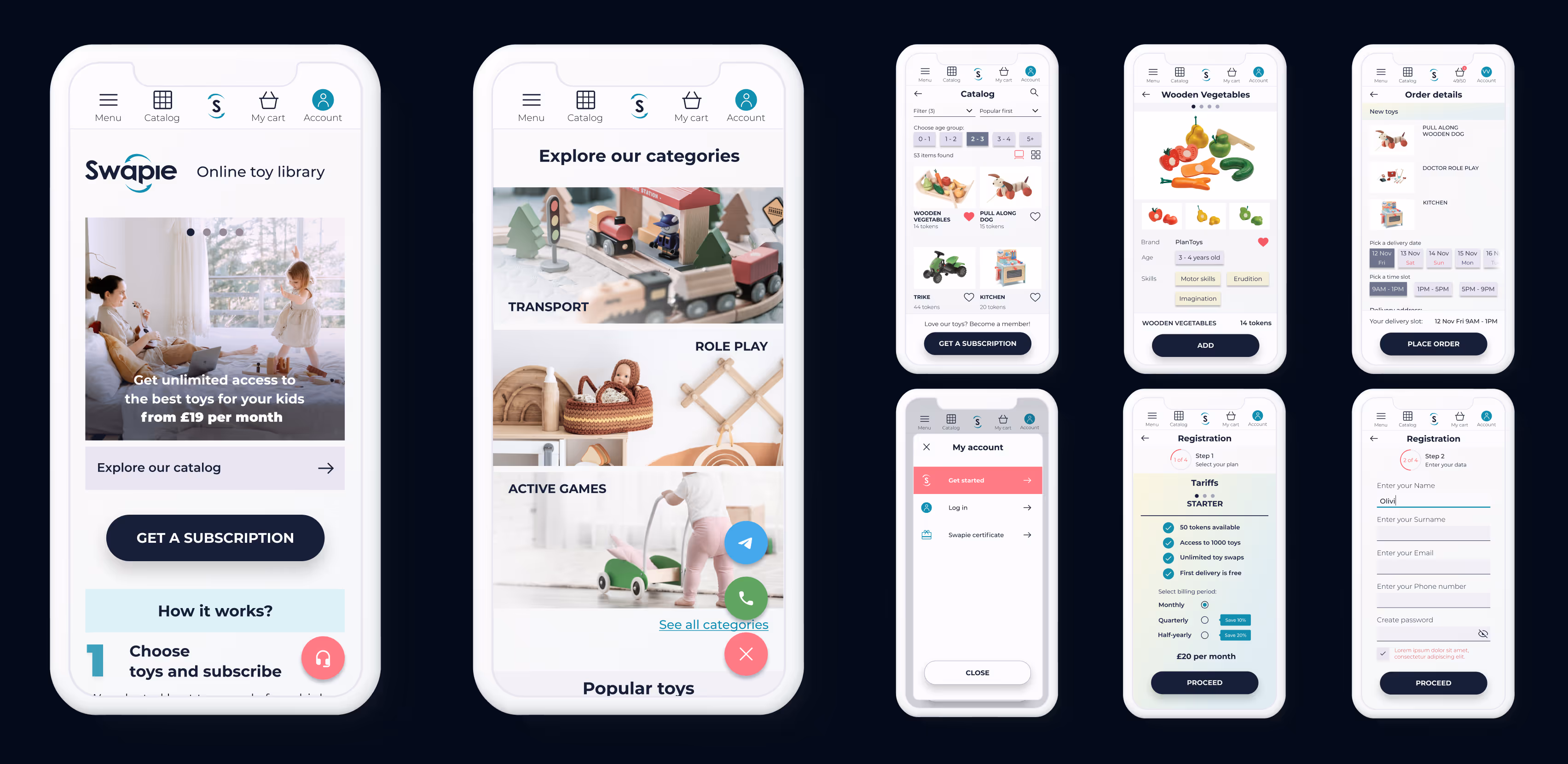


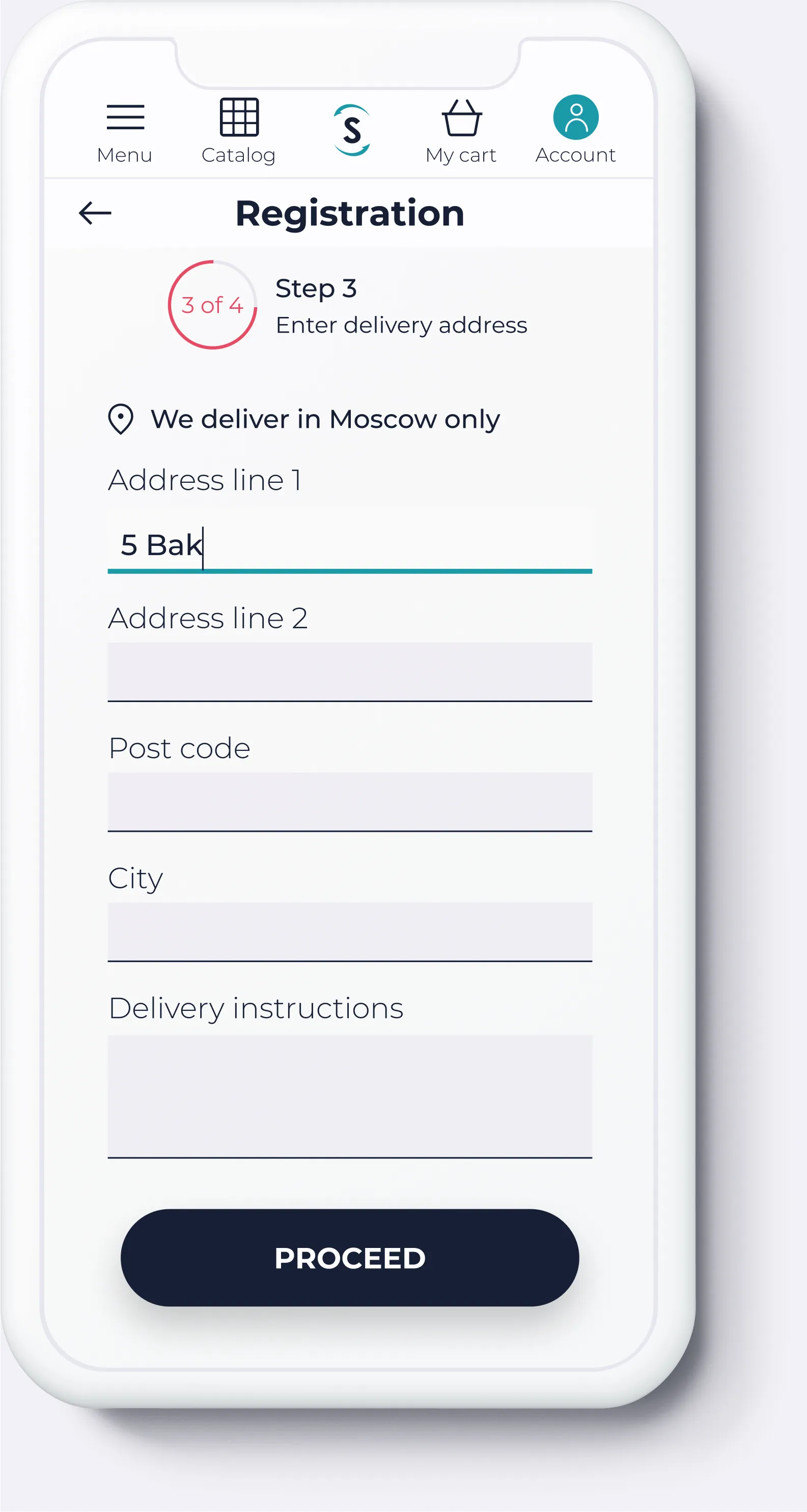
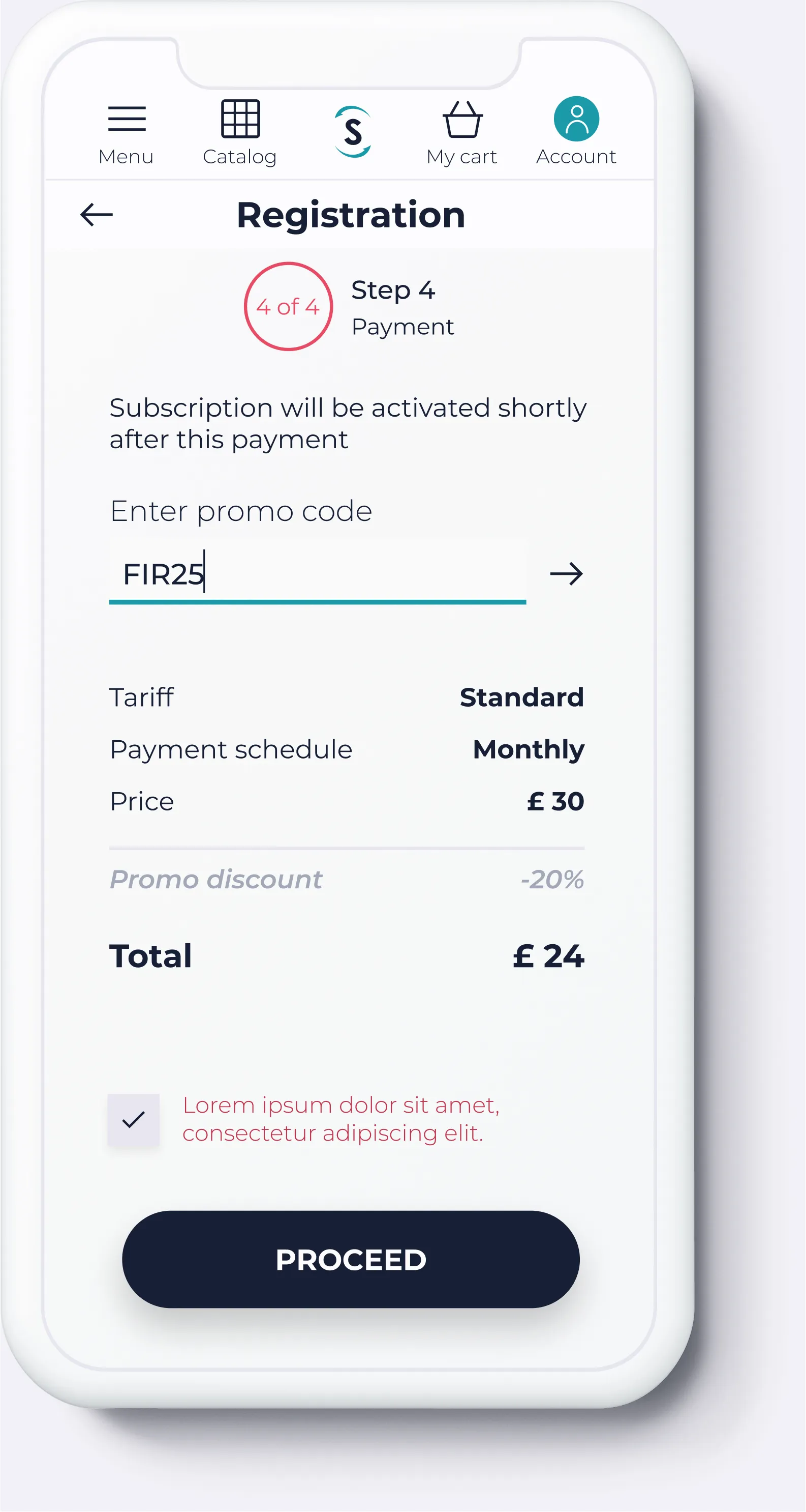
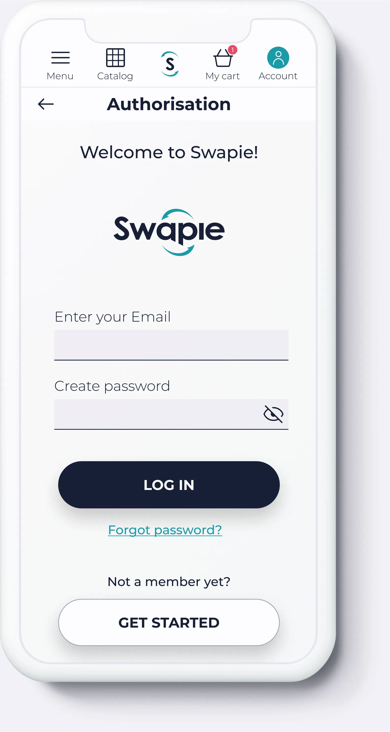
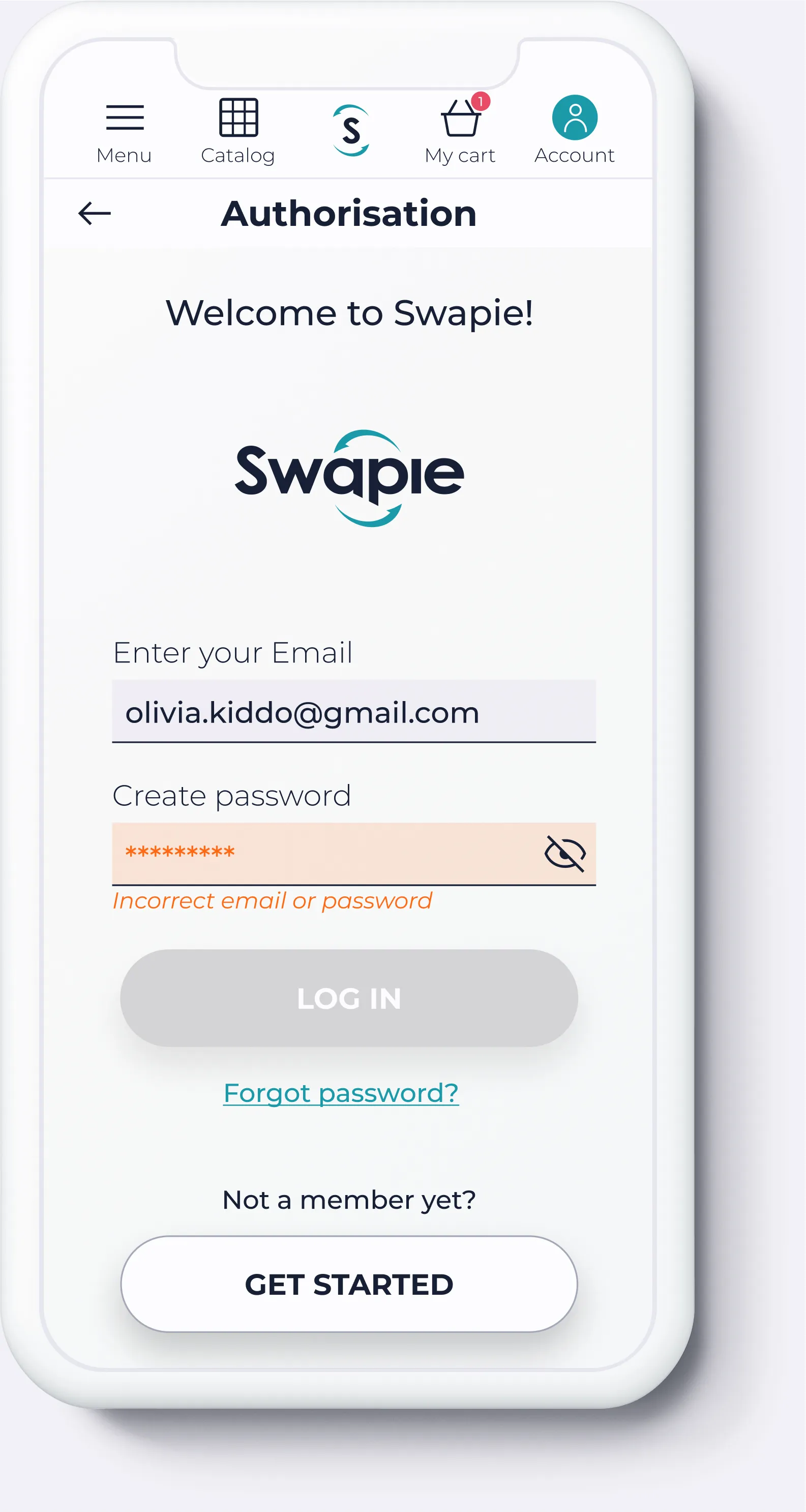
The deliverable for this project was the prototype in Figma, which you can test below.
01. Overview
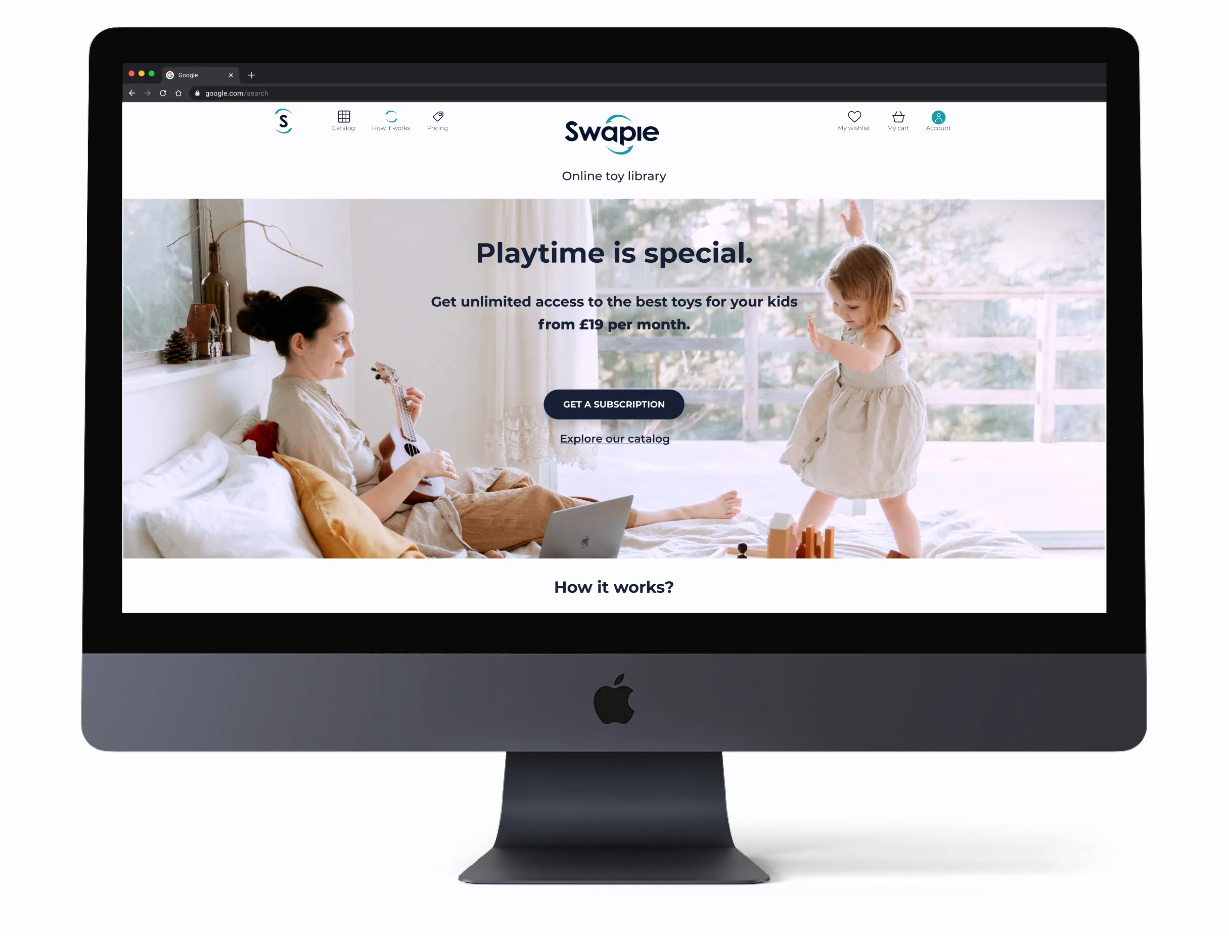
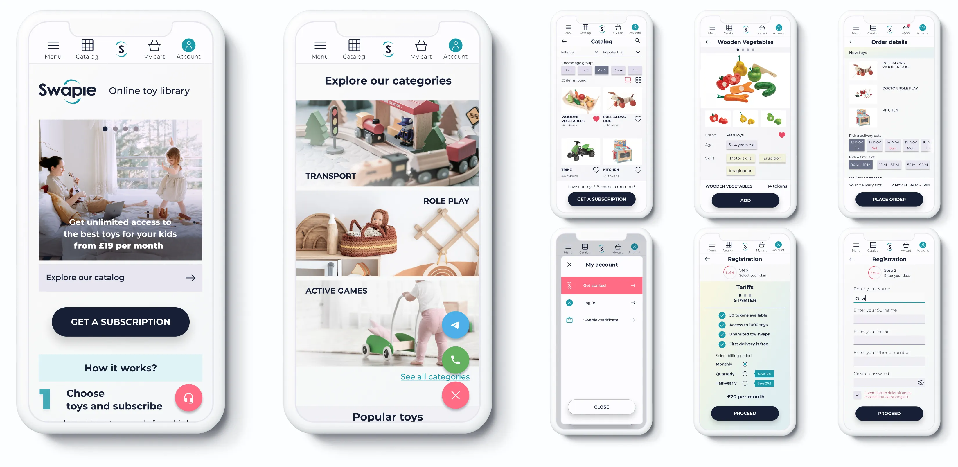
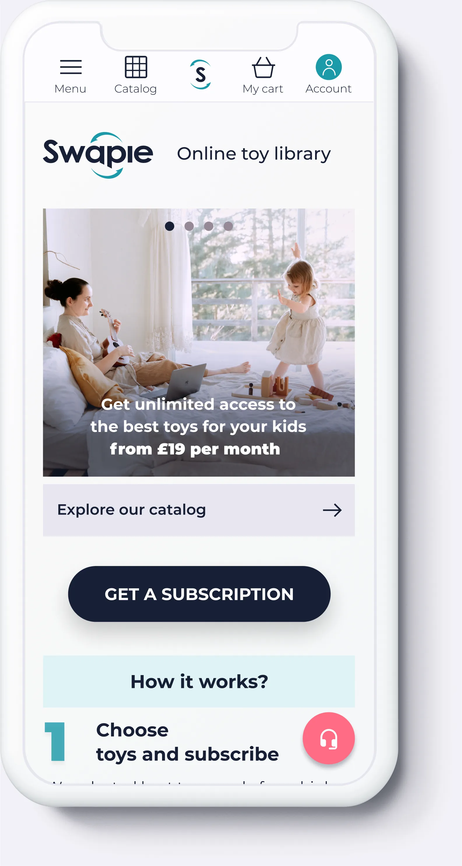
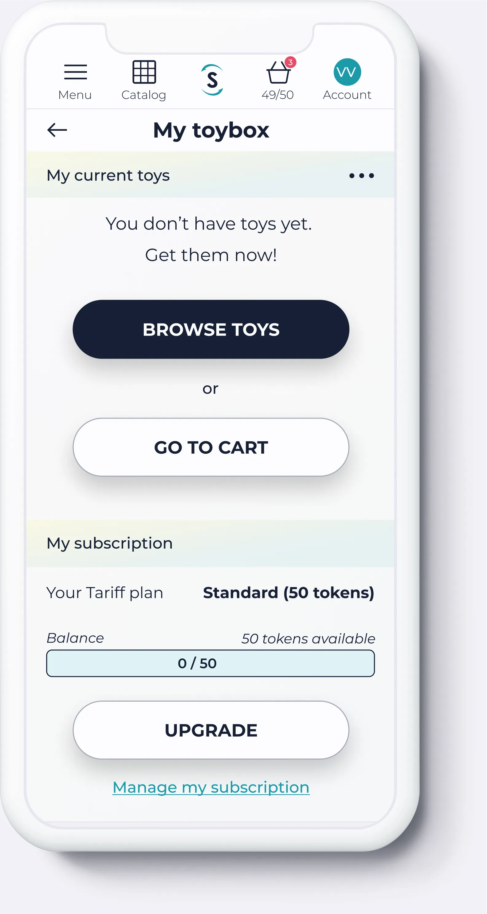
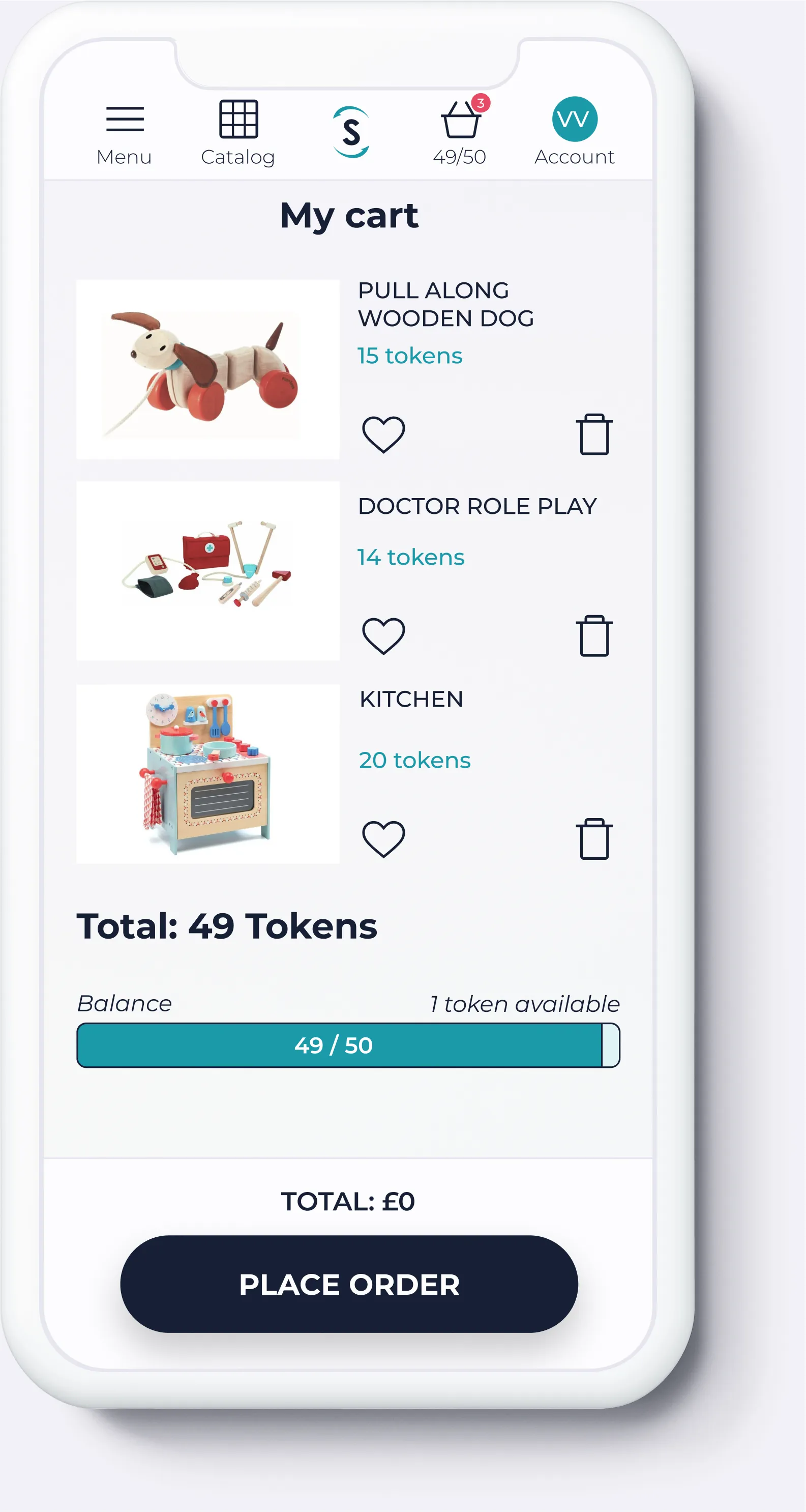
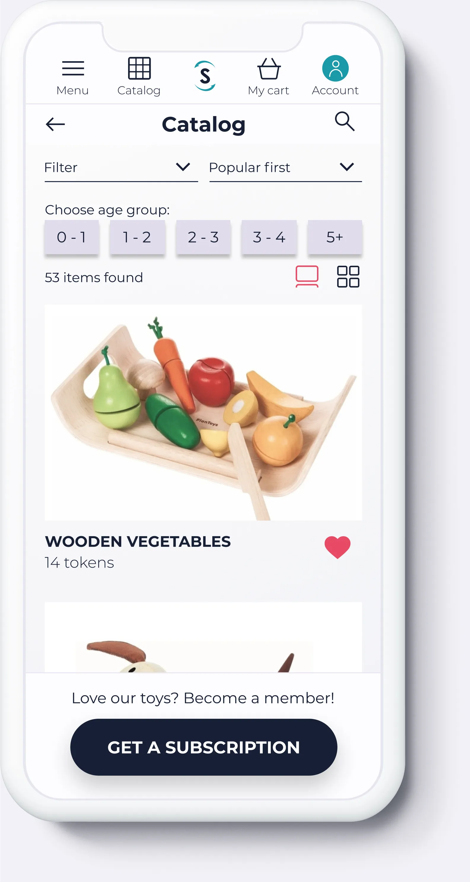
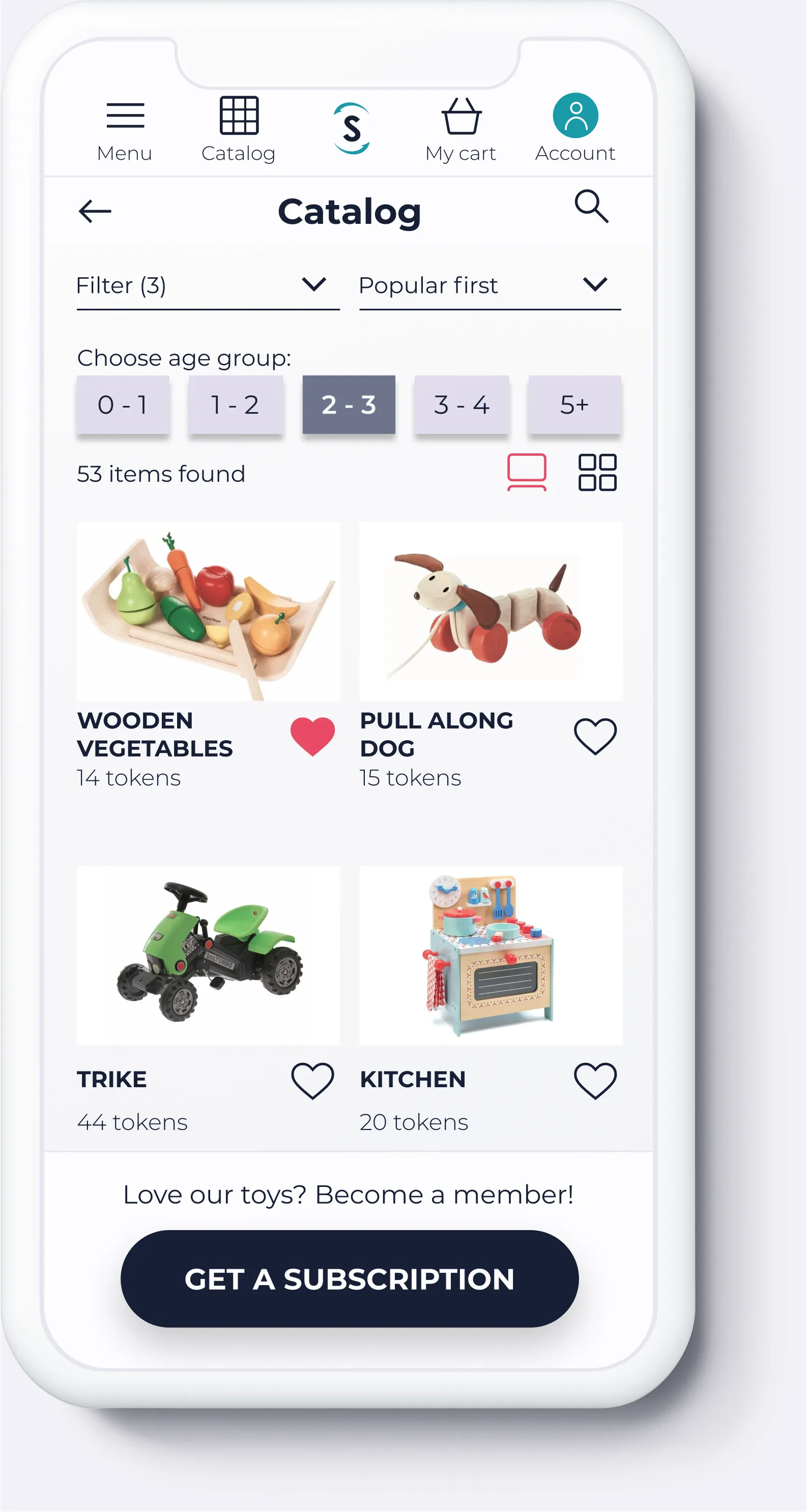
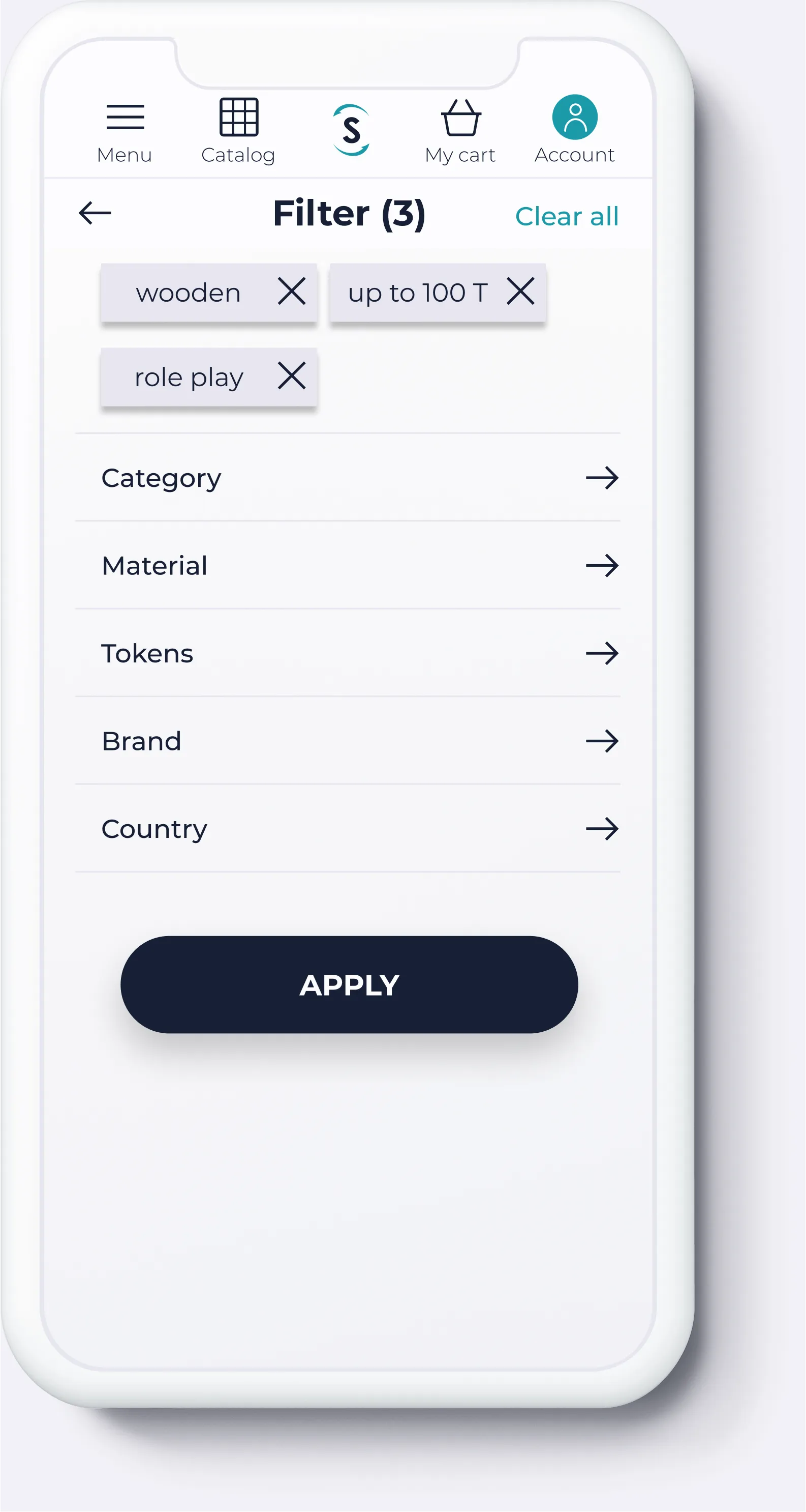
In this case study, I share how I designed Swapie — a toy subscription startup I helped build from the ground up in 2021.
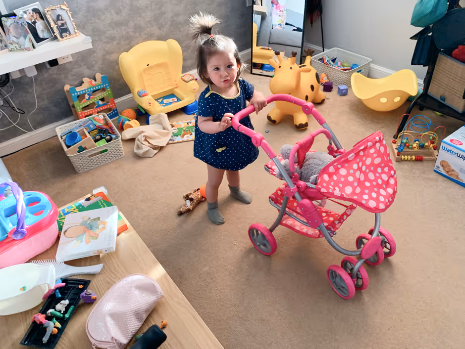
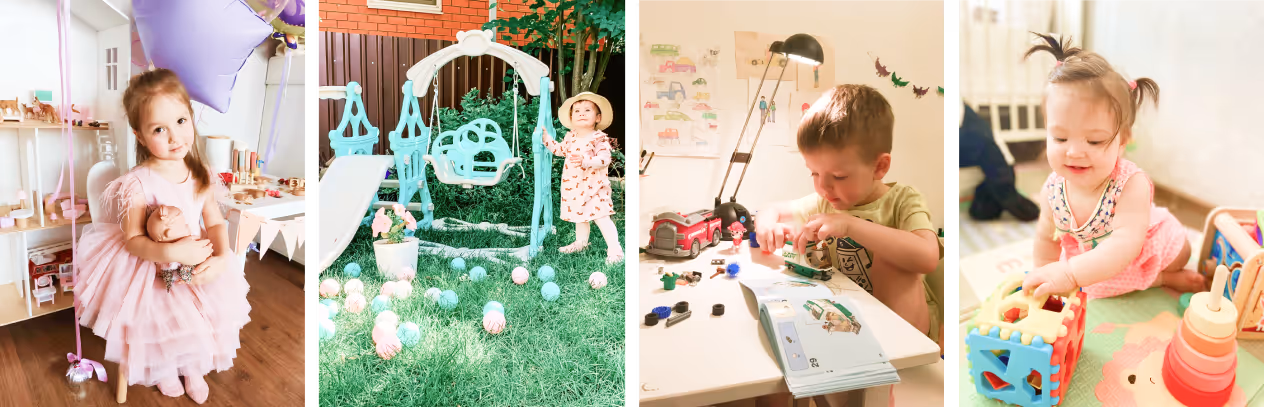
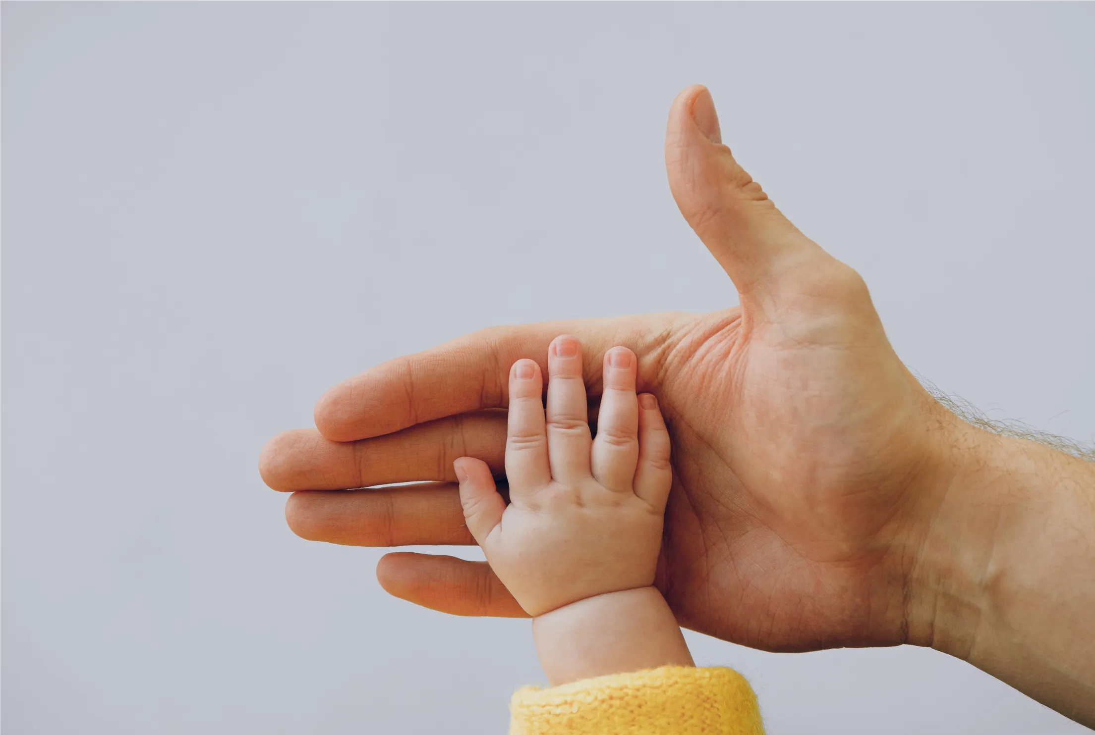
Born out of a personal frustration as a parent, Swapie aimed to make toy sharing simple, sustainable, and joyful for families. My goal was to create an MVP that turned this idea into a real, lovable product experience. We sold over a hundred subscriptions and received great offers from investors.
Although the startup closed in early 2022 due to the political situation in Russia, the journey was rich in hands-on learning. It’s a great example of my visual design, branding, and human-centred design skills in action — from concept to launch.
This project will always stay close to my heart — it was truly designed with love, care, and purpose.
Timeline
2021 - 2022
Project type
Web product design for an online toy library startup
Team
It's a family project: 1 Product Designer (me), 1 co-founder/engineer (my husband)
My role
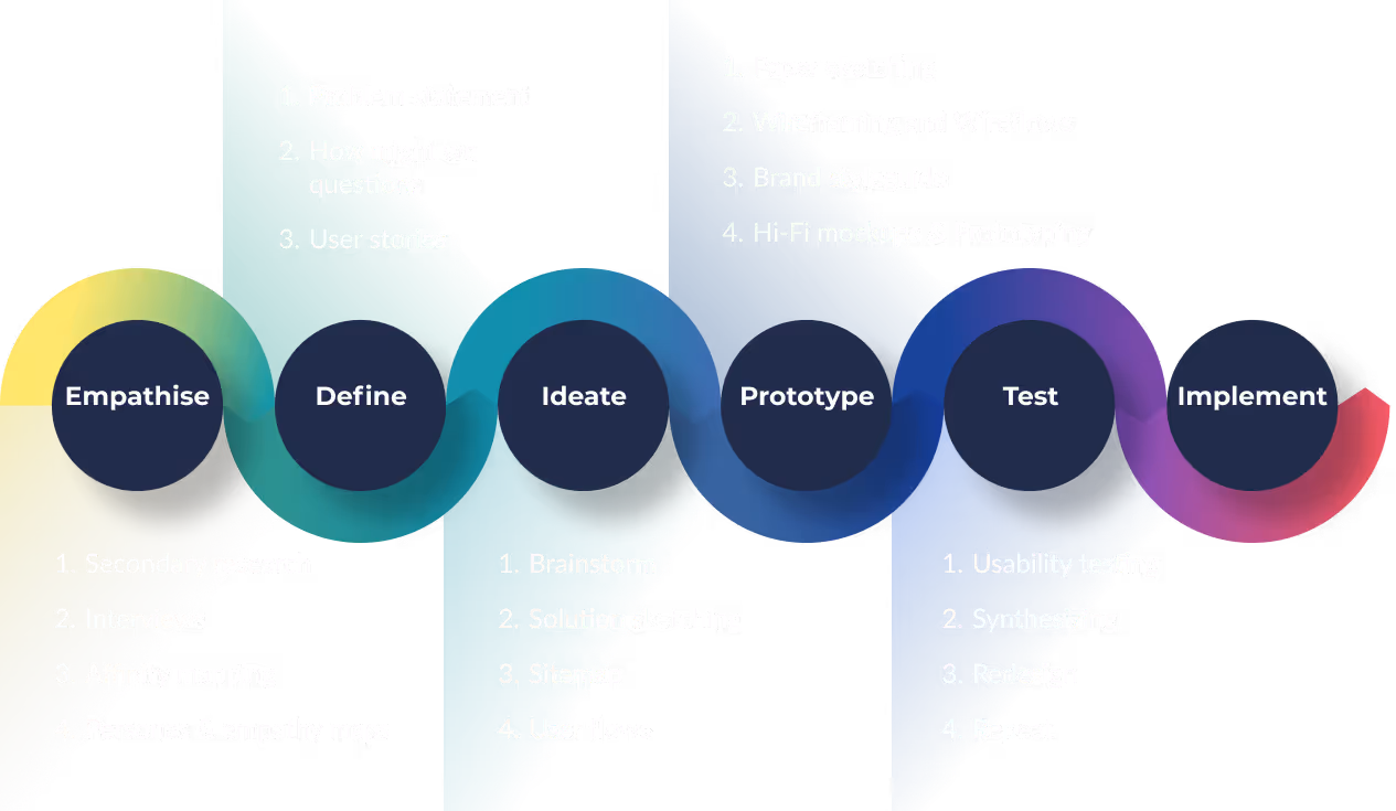
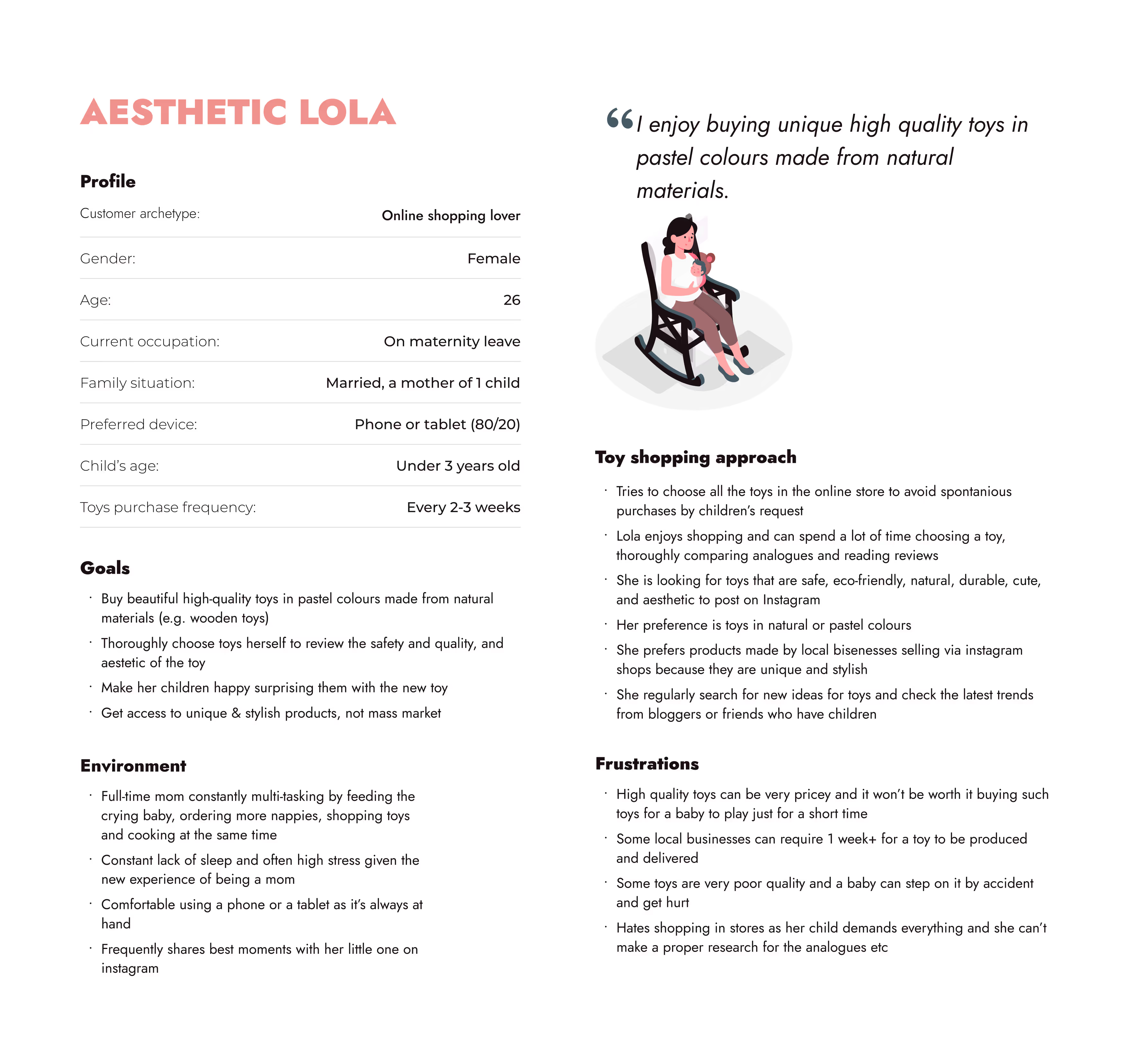
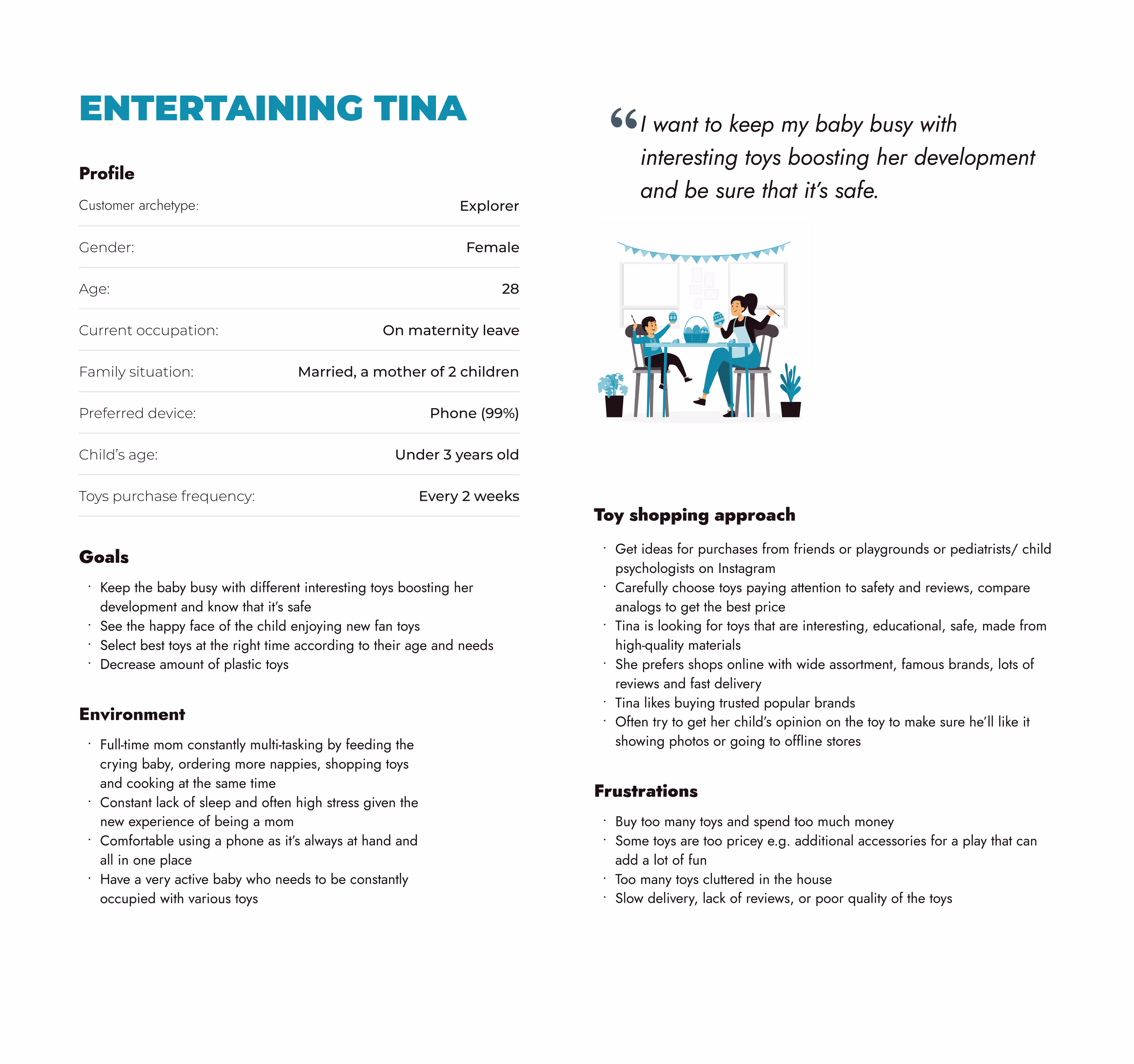
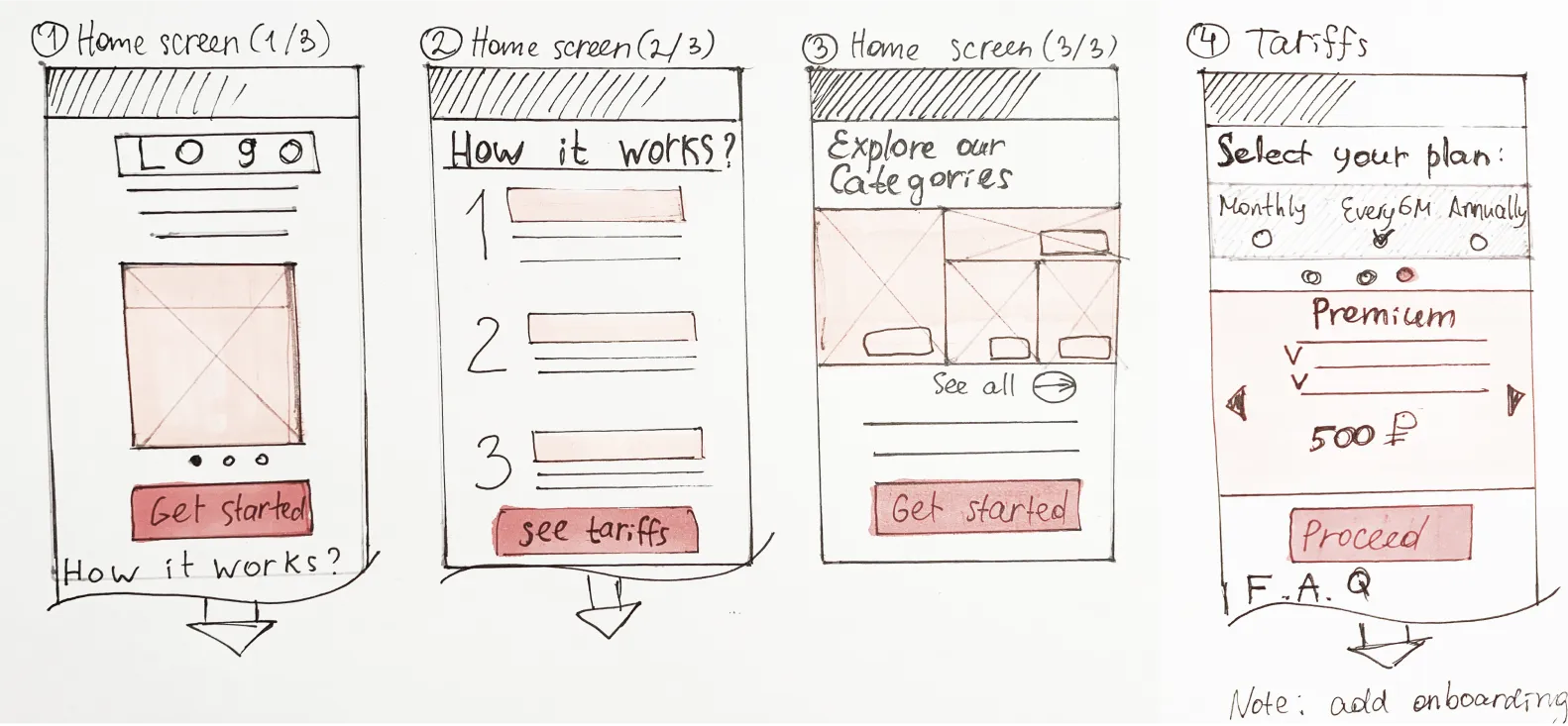
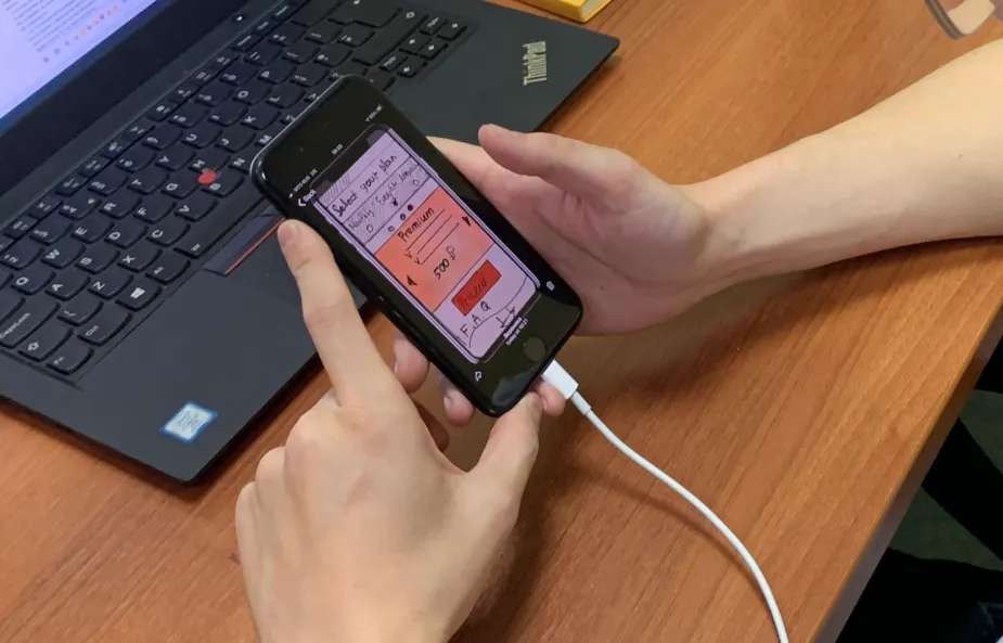
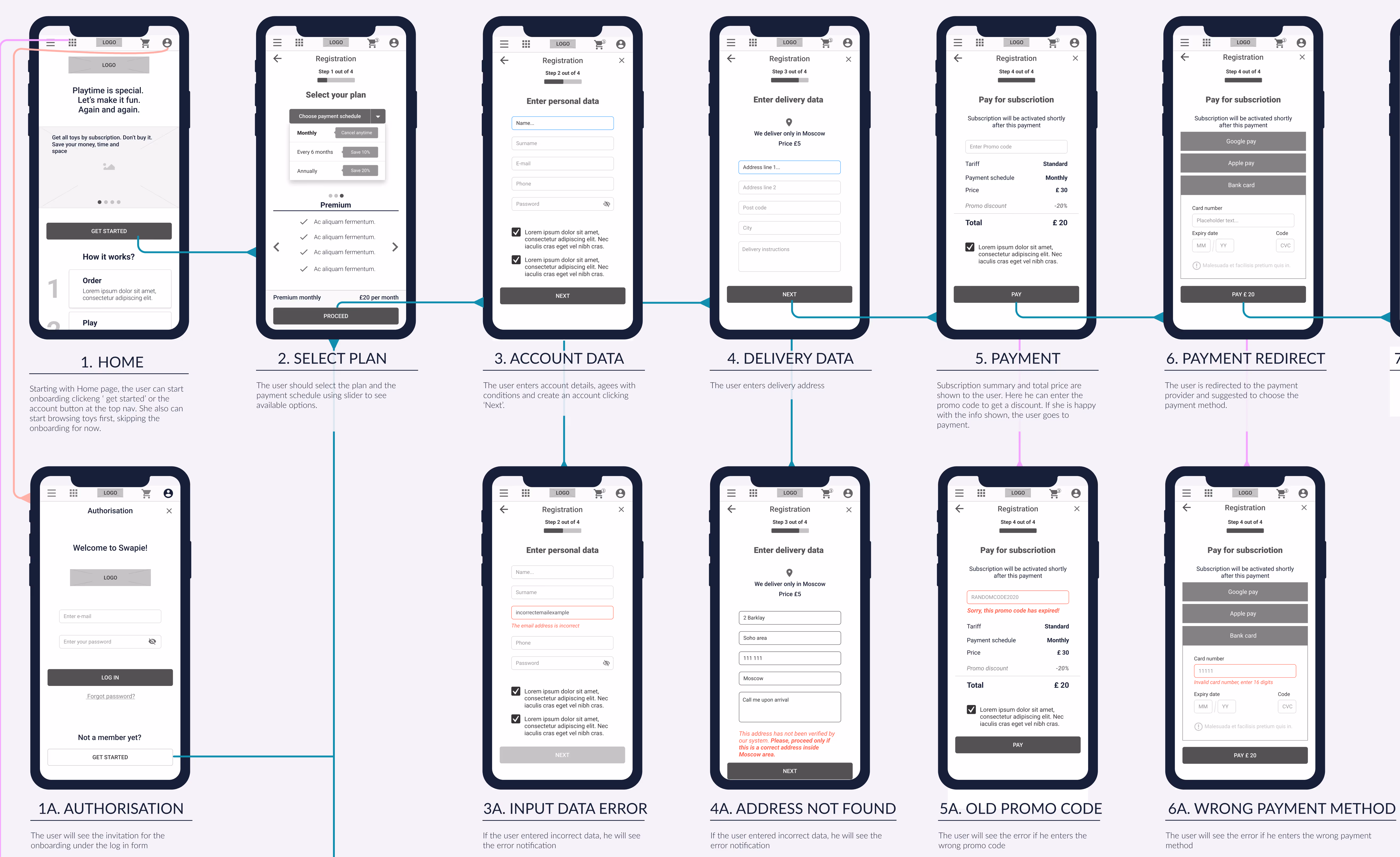
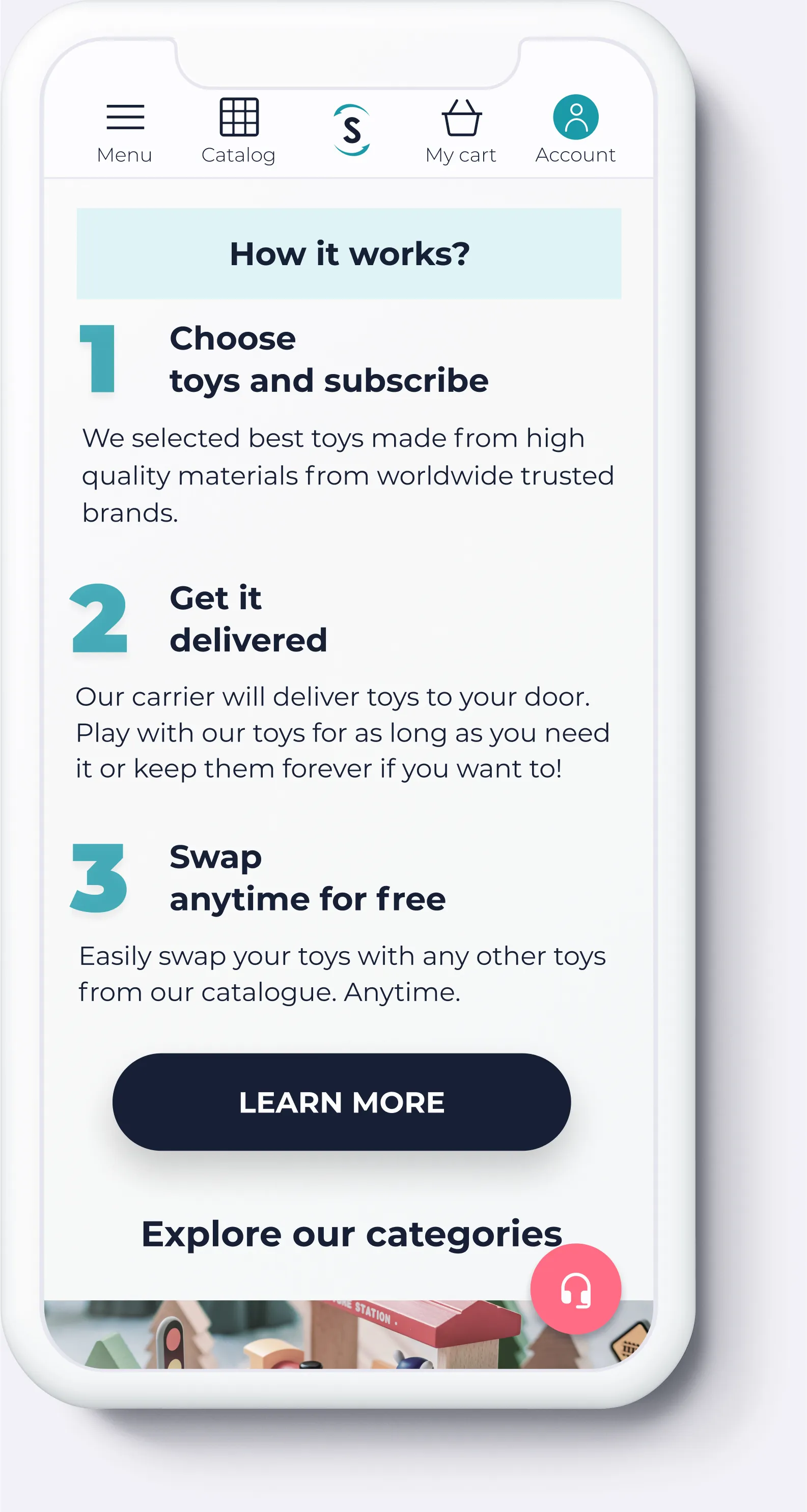
As a co-founder & product designer, I was responsible for the product design from idea to production: User Research, User Interviews, Personas & Empathy Mapping, User stories and flows, Sketching, Wireframing, Visual Design, Prototyping, Testing.
Skills
- End-to-End Product Design: From idea to MVP launch, shaping UX, UI, and prototypes.
- User Research & Insights: Conducted interviews, surveys, and persona mapping to drive decisions.
- UX Strategy & Flow: Designed clear, intuitive user journeys and information architecture for a complex subscription model.
- Visual & Brand Design: Crafted accessible, joyful, and trust-building UI aligned with brand values.
- Rapid Iteration & Problem-Solving: Tested, refined, and adapted under startup constraints to deliver a viable MVP.


.jpeg)