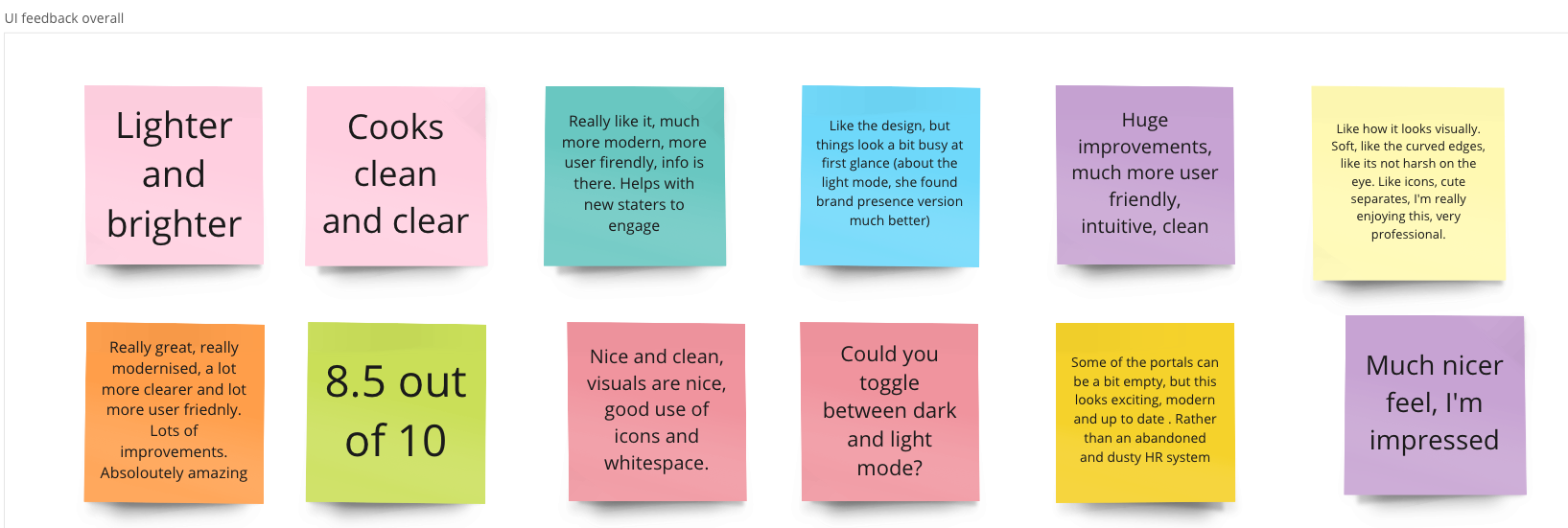
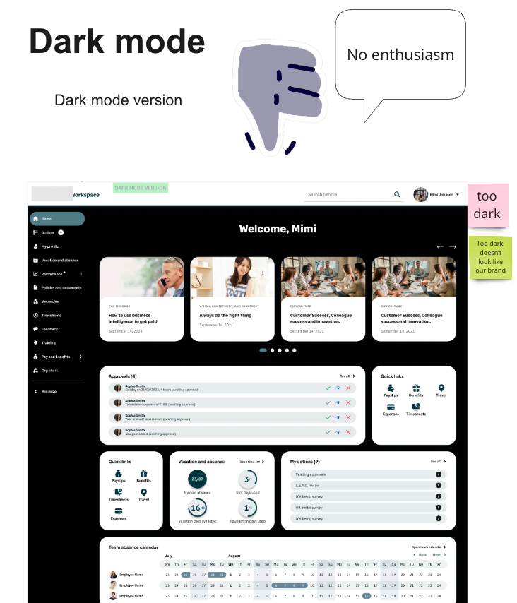
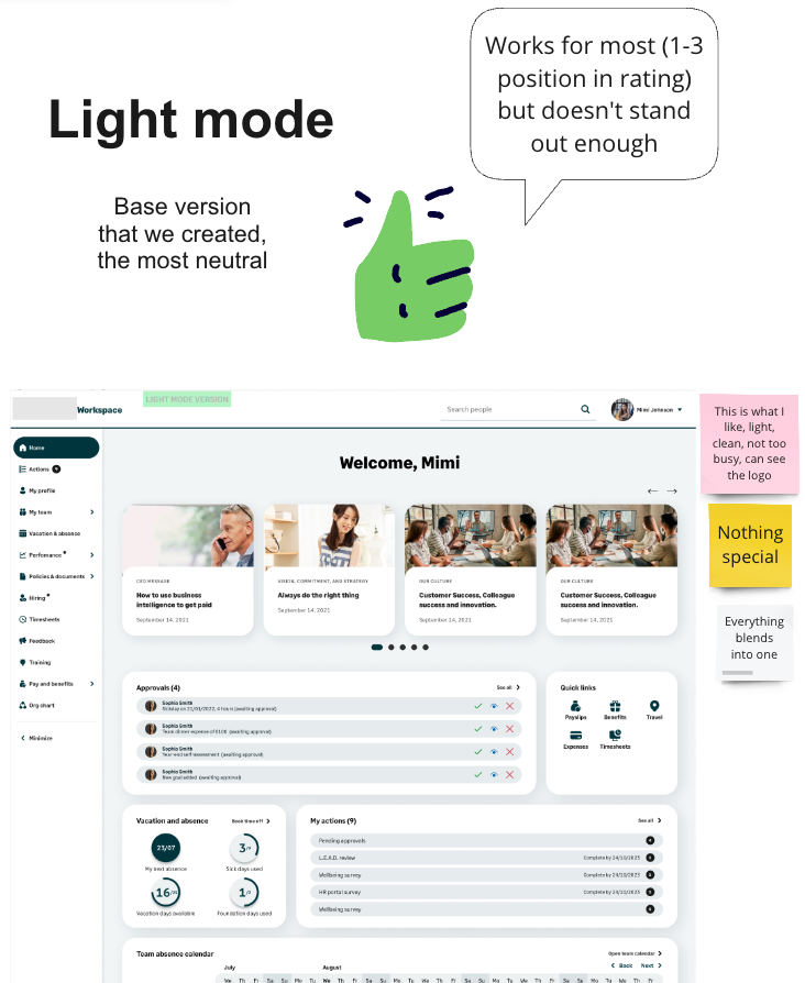
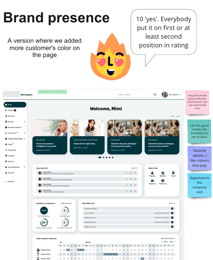
Feedback

Case study

Workforce Experience: Balancing customer customisation, new brand DNA, and end-user goals.

01. Overview

Sage People (£26M ARR) is a Salesforce-based, white-label B2B SaaS HR suite serving 500k end users worldwide. It helps mid-size multinational organisations manage HR, payroll, and talent acquisition with highly customisable workflows, global compliance, and branding flexibility.

This project focused on the employee-facing portal where end users (employees) complete HR tasks such as booking time off, submitting reviews, managing teams and updating personal information, while HR managers share company news and collect employee data.

Project goal was to design a modern, user-friendly, and accessible employee portal that elevates customer satisfaction, strengthens brand and functional customisation, and improves business outcomes. Specifically, we aimed to:

  • Increase NPS and overall customer satisfaction with the product UX
  • Reduce customer churn caused by poor UX
  • Support sales by providing a competitive, intuitive product experience
  • Decrease daily employee queries to admins by making the product more intuitive
Timeline

2022 – 2023

Project type

Redesign of Sage People’s employee web portal

Team

1 Design Lead (me), 1 Supervising Designer, Nick Antram (Principal UX Designer)

Support: Sage Design System, Brand, Accessibility, Motion Design

My role
  • Defined the new UI strategy and led all the design stages for the redesign of the homepage, profile, and navigation.
  • Partnered with the Design System team, contributing HR components and UX insights.
  • Presented to 200+ customers in webinar and launched post-release survey to measure success.
  • Led continuous improvements in 2024, refining homepage and navigation.
Skills
  • UX & Visual Design: Delivered a modern, accessible, and brandable UI that became the signature homepage of Sage People, recognisable to customers and competitors.
  • Strategic Thinking: Created a scalable design foundation that guided all subsequent Workforce Experience pages and features.
  • User-Centered Research: Conducted interviews, surveys, and usability testing across multiple personas to inform design decisions.
  • Stakeholder Leadership: Facilitated workshops with 20+ stakeholders and presented design strategy to 200+ webinar participants.
  • Data-Driven Impact: Validated design through NPS (+21 points), UX satisfaction (+25%), and a post-launch survey showing high ratings across homepage usability, layout, and aesthetics.
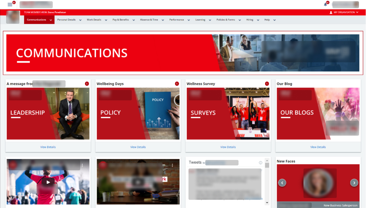
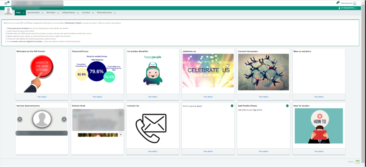
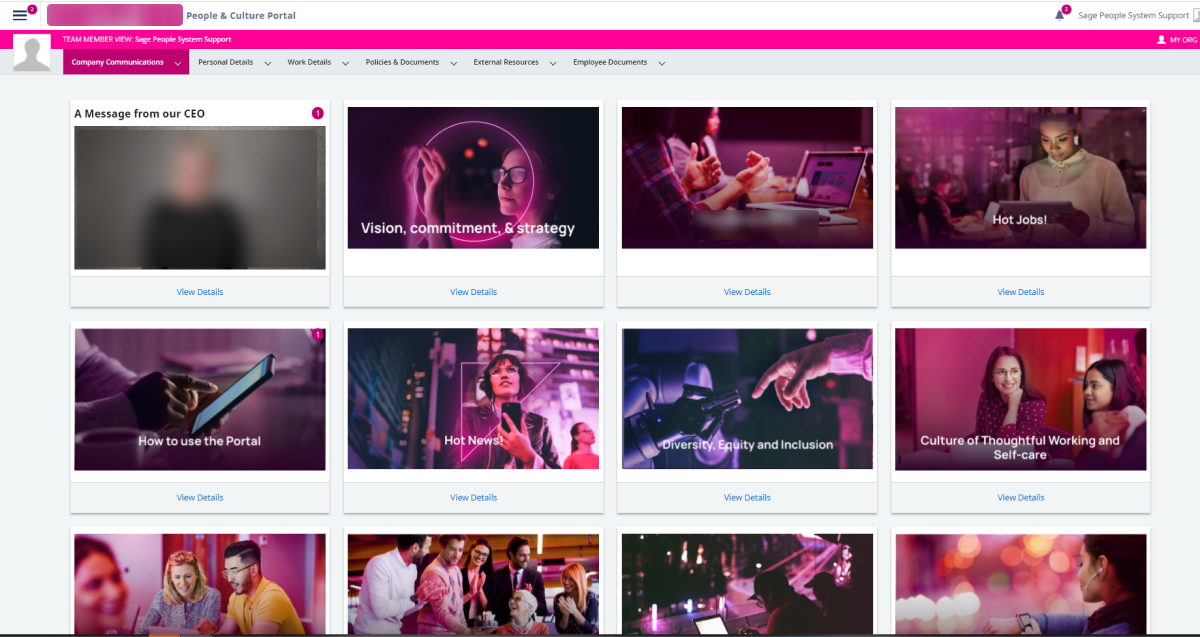
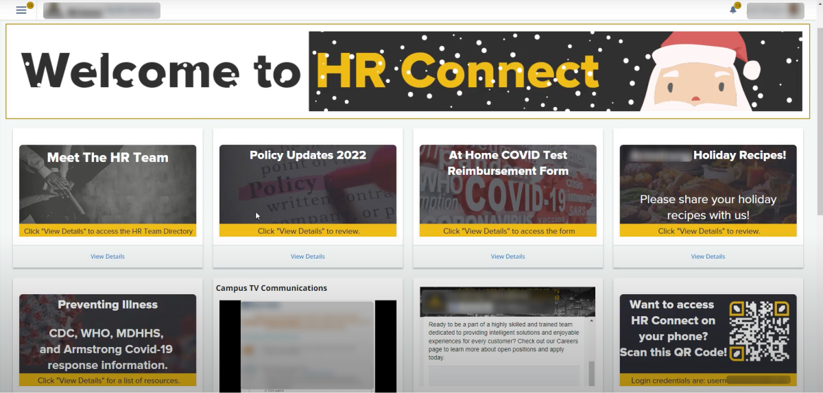
The look and feel of the old employee portal homepage with the navigation

02. Problem

When I first joined the employee portal redesign project, it felt like yet another B2B tool — feature-rich, but poorly designed. Both users and administrators struggled with:

  • An outdated, inconsistent UI that felt like a patchwork of legacy designs
  • Admins spending excessive time customising the homepage, which became a burden
  • Confusing dual navigation
  • Unclear 'Viewing as…' pages
  • Difficulty returning to their own profile
  • Too many clicks to reach key tasks

Our team spent weeks immersing ourselves in the product and analysing user feedback. We reviewed hundreds of NPS comments and EBR reports, and ran shadowing sessions with real end users. Their frustrations were palpable:

The interface is clunky and dated. There is no dashboard, the features are clearly old and not reflecting our companies positioning as a modern and progressive employer.
I’m confused by the people bar and team member dropdown. How are they different?
Search box should be in the header.
I get lost so easily.

03. Challenges

Challenge 1. Lack of sufficient end-user data

Because of strict customer privacy policies and the nature of the data stored, we can’t embed tools like Pendo to collect behavioural insights. Instead, we have to rely on customer input or reach out to end users directly — but only with the customer’s approval and on a case-by-case basis.Because of customer privacy and the fact that they store personal data, we can’t embed tools like Pendo to collect usage insights. This means we have to rely on direct customer input or contact end users only with the customer’s approval on a case-by-case basis.

Tackling end-user problems often feels like one of my favourite Harry Potter scenes — we know there’s something important to find, but we’re not quite sure what it looks like or where to start.

Video transcript

"Ok, there is something we need to find."

"Alright, what is it?"

"We don't know."

"Where is it?"

"We don't know that either...I realise that it's not much to go on."

"That's nothing to go on."

Challenge 2. Complexity of personas

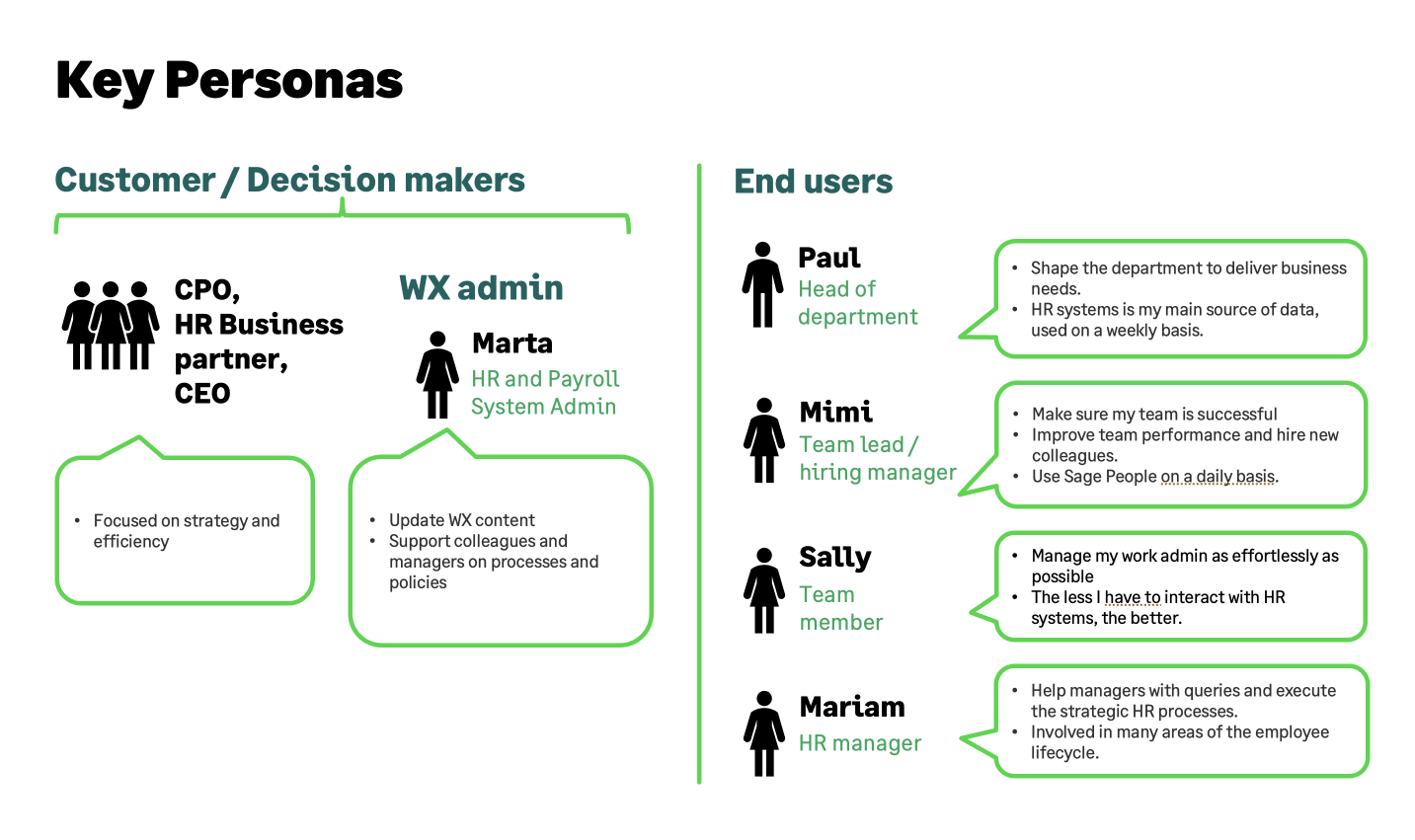
B2B software typically serves multiple layers of users with very different needs. In our case, decision-makers such as CEOs, CTOs, CFOs, and department heads rarely use the software directly. Yet, they still have specific expectations around branding, workflows, and admin experience.

Meanwhile, end users interact with the product daily and have a completely different set of pain points. Improving their experience is a long-term investment — but when end users love the tool, administrators are far more likely to stay loyal to it.

Adding to the complexity, many customers build new pages, services, and workflows directly in Salesforce. This makes it challenging to design solutions that serve all user types without disrupting established workflows.

Challenge 3. White-label solution is the USP of Sage People

With its wide branding options, the product often looks very different and is rarely recognised as Sage People. For most users, it’s simply their company’s HR portal.

Challenge 4. A new, highly opinionated Sage brand

When this project began, Sage had just launched a major rebrand — bold, vibrant, and human, with dark mode and distinctive illustrations. It was exciting and fresh, but the product design system had only started adopting it, and we couldn’t wait a year for it to catch up.

Since Sage People had never fully used the product design system and, as a white-label product, operated differently from other Sage tools, we planned a bold move: define our own UI inspired by the new brand.

The challenge? The brand was highly opinionated, and we feared it would clash with our customers’ visual identities. Could the new Sage brand and white-label flexibility truly co-exist?

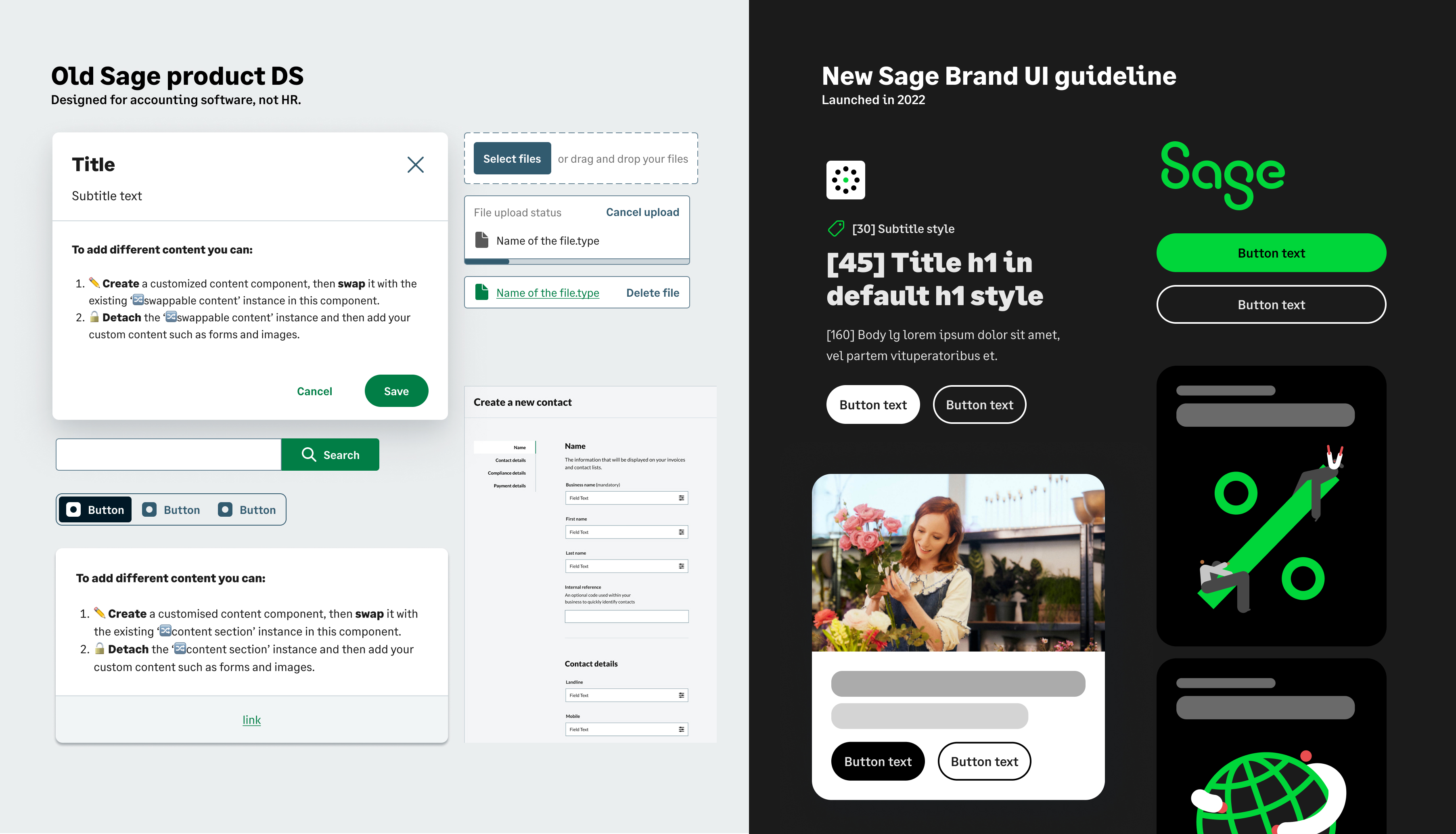
The drastic visual gap between Sage’s product DS and the new brand UI guidelines pushed us into uncharted territory.

The big question:

Can Sage’s new brand and white-label flexibility truly co-exist — and still deliver a cohesive, user-friendly experience?

04. Solution

This project was a journey of vision, iteration, and relentless attention to detail. I led the UX design from start to finish, shaping every decision through research, customer feedback, and deep understanding of the product’s complexity. Our goal wasn’t just to modernise the interface — it was to rebuild confidence, clarity, and joy in how people use Sage People every day.

Designing Harmony: Sage’s New Brand Through a White-Label Lens
Clean, accessible, and brandable UI

We didn’t aim to “make it prettier.” We wanted a visual identity that felt instantly recognisable, accessible, and adaptable across brands. The homepage, in particular, became the new face of Sage People — a signature design featured in marketing campaigns and instantly recognisable by customers and competitors alike.

To achieve this, we used the Sage Design System as a foundation, but carefully evolved it:

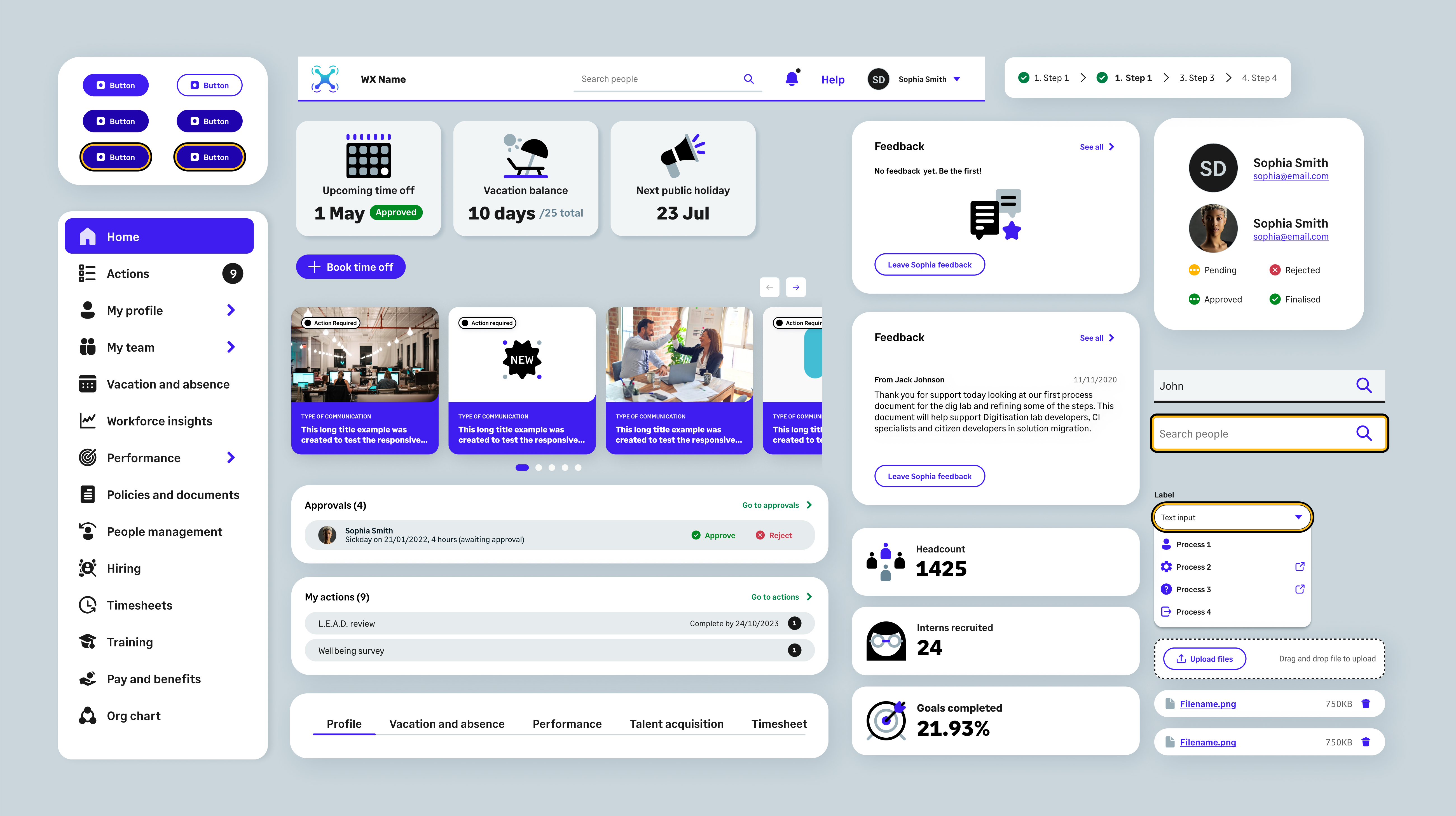
  • Softer corner radius to make the interface more human and approachable and in line with the new brand
  • Interactive elements using customers’ brand colours instead of Sage green. Keep light mode based on the user testing results.
  • A new set of branded illustrations to bring warmth and engagement
  • Missing components such as carousels, widgets, calendars, and accessible step flows designed from scratch

The new visual strategy was tested across five branding variations to ensure visual consistency, contrast accessibility, and brand flexibility. I personally ran design sessions with customers to validate the experience and fine-tune it to real-world needs.

Simplified navigation

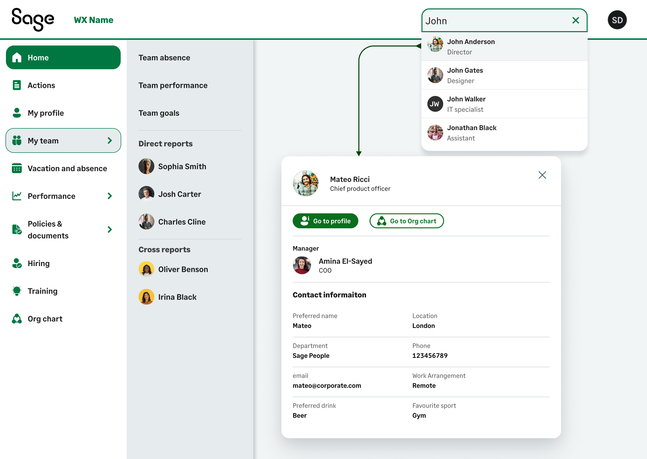
Navigation was one of the biggest pain points — users often got lost or needed too many clicks to complete basic tasks. We replaced the old layout with a dual system: a sticky left-hand menu for structure and a top header for global actions. This gave users immediate access to their homepage, people search, org chart, and profiles without losing context.

New Sage People portal navigation

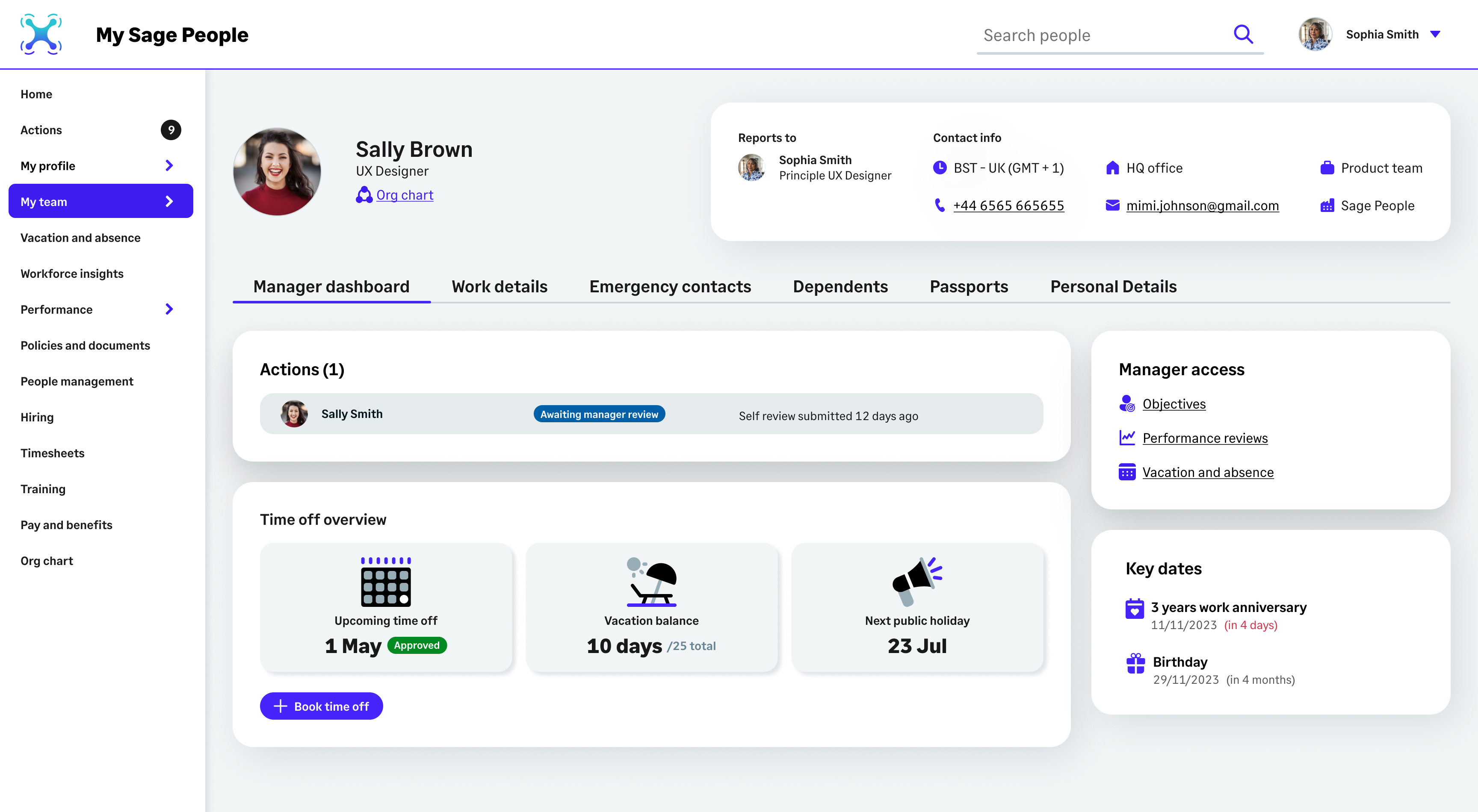
My profile and direct report profile

The new My Profile and Direct Report Profile experiences followed the same principle — clarity and flow.

  • Tabbed navigation reduced cognitive load and unnecessary clicks
  • Admins could act on behalf of employees with clearer task flows
  • Switching between personal and team views became seamless

I’ll never forget watching our first usability tests: users paused, smiled, and said, “Finally — it just makes sense.” That moment captured what we set out to achieve: not just usability, but genuine delight.

Homepage redesign: the new face of Sage People

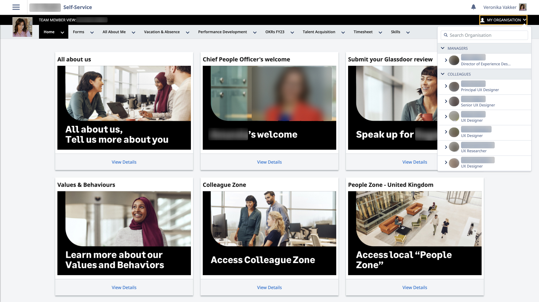
The homepage became our anchor — the first impression and the foundation for every other screen. We modernised its layout while keeping existing functionality intact, so customers didn’t need to rebuild content or retrain users.

The new design showcased the updated UI and brand DNA, creating a scalable, flexible structure that could support future product evolution. During testing, customers described it as

It wasn’t just a landing page anymore — it became the heart of the experience, reducing cognitive load, guiding navigation, and visually tying the ecosystem together.

We harmonised the corporate brand and the product UI, crafting a seamless and recognisable experience for customers.
Product page before and after redesign
Loading speed - the devil is in the details

Surveys revealed that users often perceived the product as slow — particularly during the first load, which could take up to 15 seconds. While improving backend performance wasn’t in our scope, we knew perception mattered just as much as speed.

Previously, users simply stared at a blank screen for 15 seconds with frustration. To turn this into a more engaging experience, we introduced progressive skeleton screens and a subtle rocket animation that appeared as early as content began loading. This approach didn’t just mask waiting time — it transformed a frustrating pause into a moment of delight, reinforcing the product’s human and approachable personality.

Sage People new loading experience demo

05. Results

By the end of 2024, Workforce Experience 2.0 delivered tangible and measurable improvements for both administrators and employees — and a clear business impact for Sage People.

Key outcomes:
  • NPS increased from -15 to +6 — a 21-point improvement, reflecting a major shift in customer sentiment.
  • UX satisfaction rose by 25%, highlighting the success of a more intuitive, accessible interface.
  • Sales losses linked to poor UI or lack of intuitiveness dropped by 38% (absolute) and 20% (relative share) between 2021/2022 and 2023/2024, indicating a measurable business impact of the redesign on reducing sales risk.

Post-launch survey

Satisfaction with the New WX Design Overview” (1–7 scale, 7 = highest satisfaction)
Satisfaction aspect
HR admins
End users
Aesthetic Appeal
5.41
5
Layout
4.9
4.9
Loading Speed*
4.5
3.8
Ease of Setup
4.81
n/a
Ease of Use
5
5
Navigation
5.19
5.1

Average administrator rating: 4.98
Average employee rating: 4.80
For comparison, old Sage People designs scored 3.98 on average.

This survey confirmed that the new homepage and navigation were well received, with particular praise for aesthetics and usability.

Loading speed emerged as an area for improvement, which guided our subsequent optimisation work. The survey was conducted before we introduced the new loading experience with the rocket animation and progressive skeleton screens. Next time we run this survey, I expect to see noticeable improvements in user perception on this front!

Beyond metrics, the homepage became the most recognisable element of Sage People, featured on posters, banners, and marketing campaigns, creating a strong visual signature for the product. The new UI set the tone for all future pages and features, providing a scalable foundation for subsequent design work.

My take on this project

This project reminded me that complexity isn’t the real challenge — misalignment is. You can’t please everyone, but if you stay true to the problem, make bold, thoughtful choices, and give the design time to mature, things eventually fall into place.