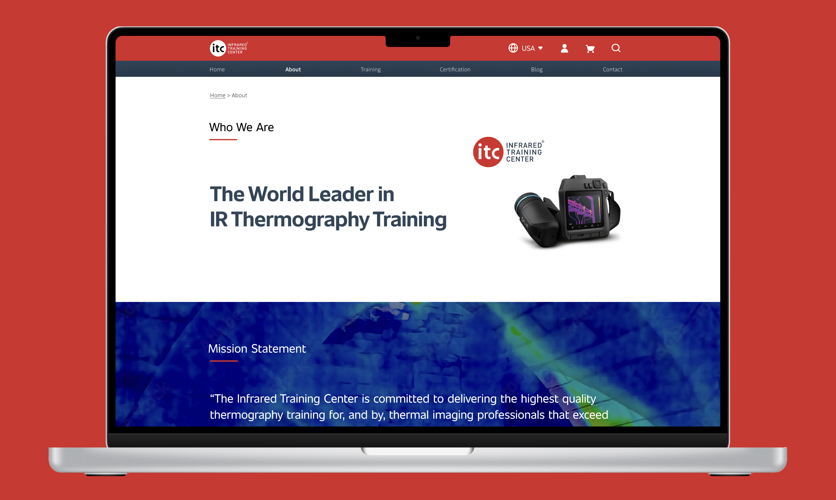
A faster, smarter way to book thermography training

01. Overview

ITC is a global leader in infrared (IR) thermography education, offering over 600 application-focused courses — from beginner to expert levels — across the globe.

The website’s primary goal is to help users find the right course and provide a seamless onboarding and purchase experience.

Business goal

Redesign an intuitive navigation and a high-converting purchase experience within a clean, modern, and accessible UI.

Timeline

2022

Project type

FutureSight design agency was hired by the Infrared Training Center (ITC) to redesign their e-commerce website, infraredtraining.com.

Team

1 Design Director, 2 UX Designers (I was a lead UX), 1 Brand Designer, 1 Project Manager, 3 Engineers

My role

I led the end-to-end UX design process—from discovery to implementation. Partnering with brand, UX, and engineering teams, I shaped the design strategy, created responsive high-fidelity prototypes, led usability testing, and ensured smooth delivery. I also managed client communication and stakeholder alignment, while mentoring junior designers throughout the project.

Skills
  • End-to-end design ownership
  • Information architecture & user flows – restructured content for clarity and ease of navigation.
  • Mentorship – guided junior designers and provided design feedback.

02. Foundation & Framing

Problem Statement

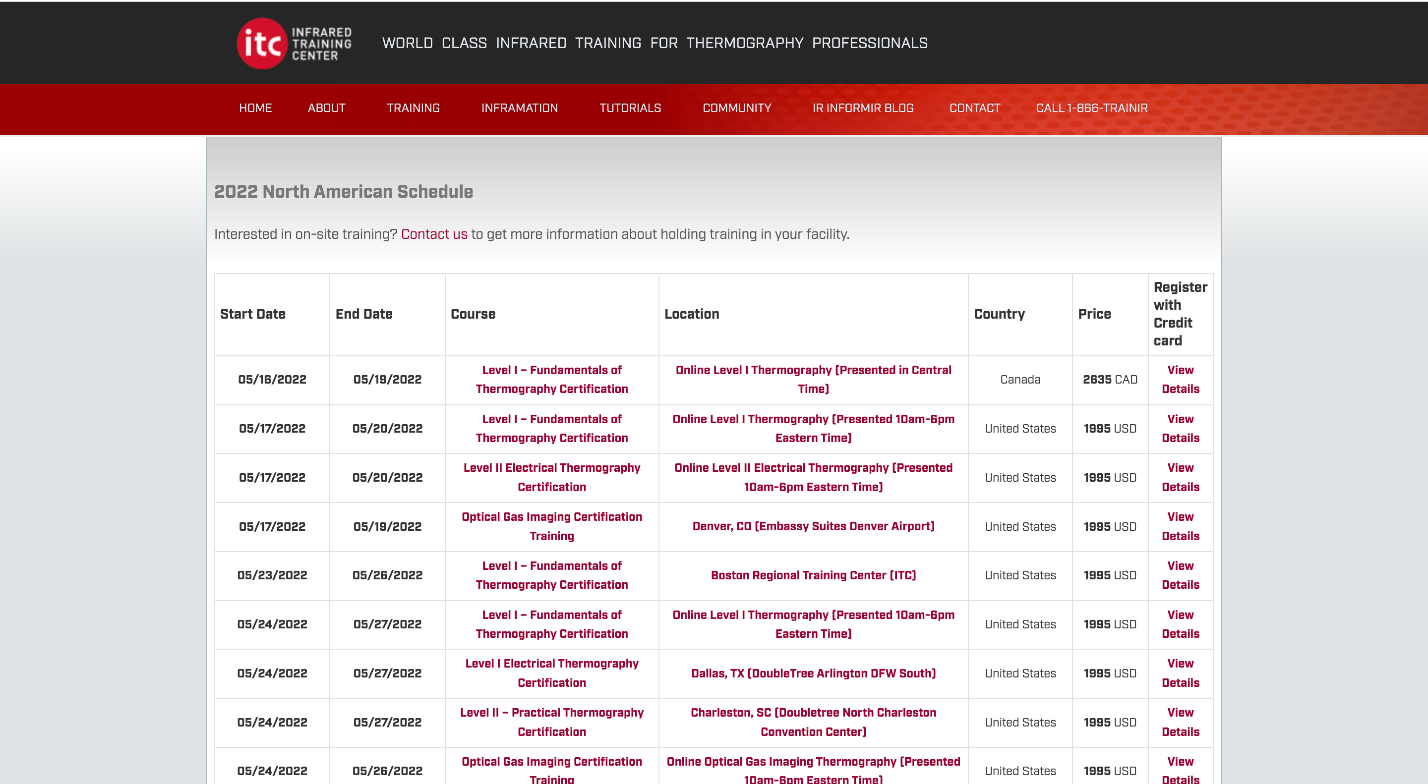
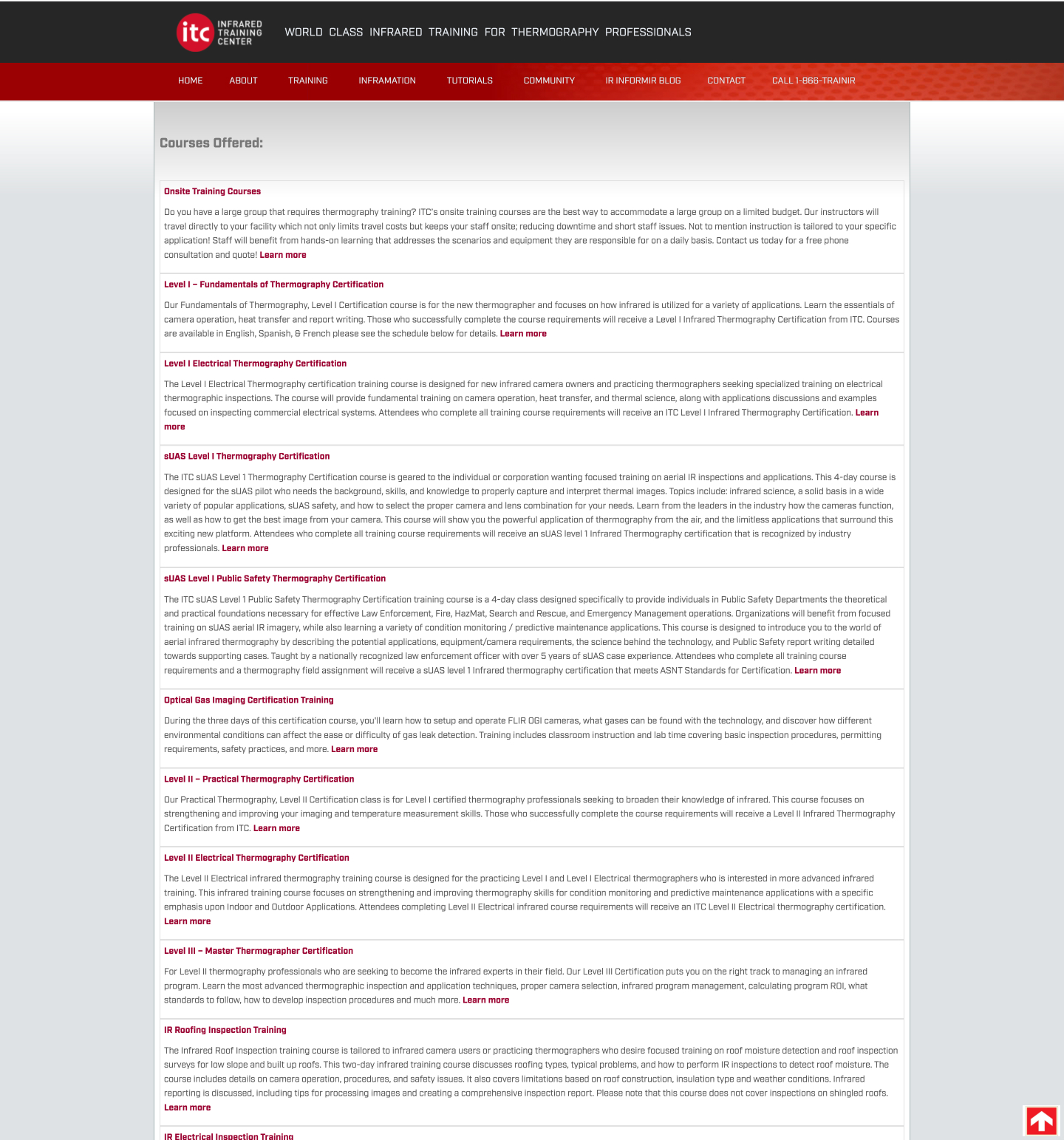
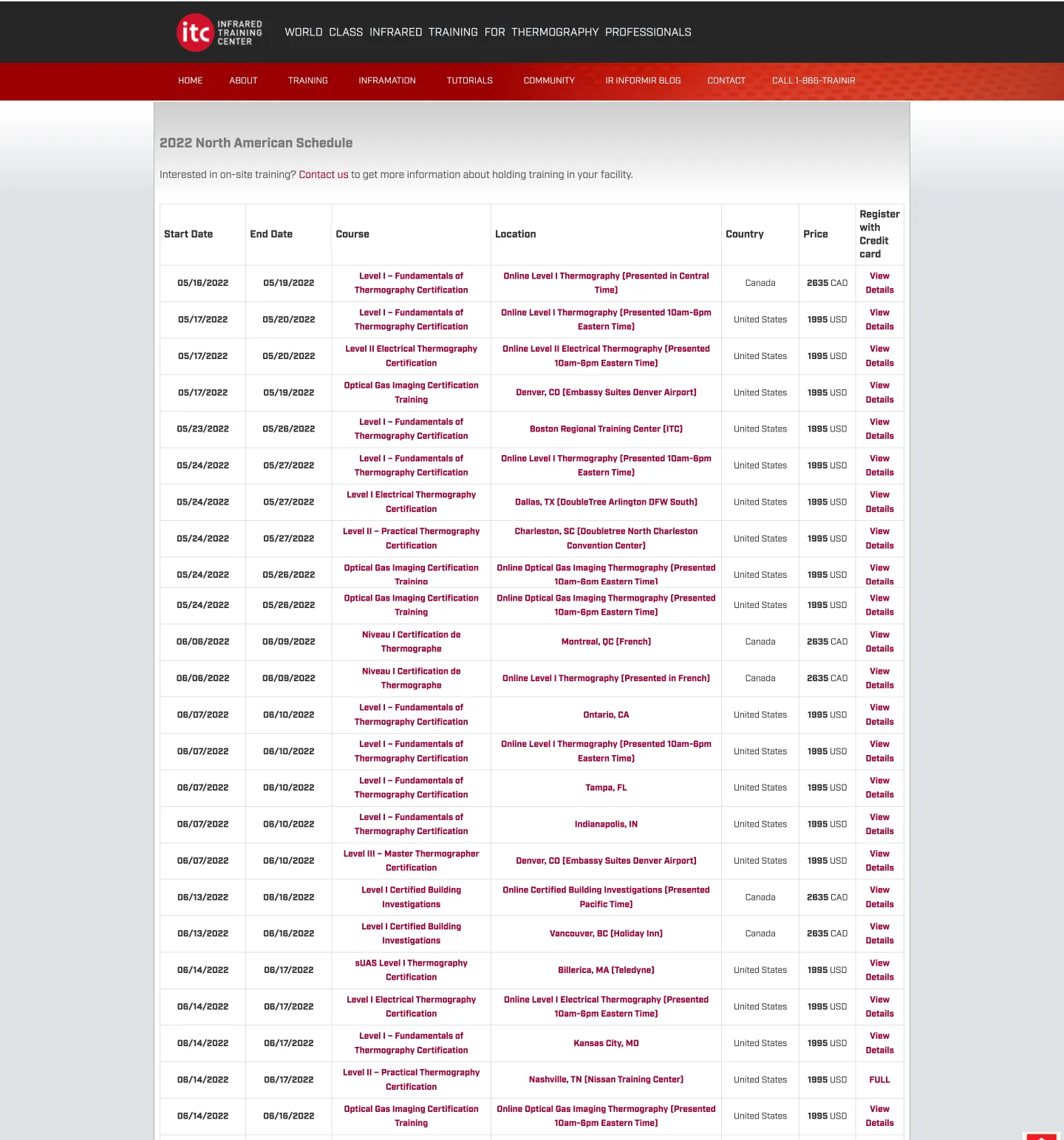
The previous website suffered from a cluttered information architecture and inconsistent user experience. With dozens of course levels, languages, formats, and hardware requirements, users often felt overwhelmed and uncertain about which training to choose. The UI was outdated, inconsistent, and no longer reflected ITC’s brand values of expertise and innovation.

How might we help users easily navigate and select the right training from hundreds of options?

Project Scope

  • Discovery – Secondary research, surveys, competitive analysis, personas
  • Initiation – Content analysis, project planning, feature briefs, user flows, low-fidelity wireframes
  • Solution testing – Usability testing, heuristic evaluation
  • Prototyping – High-fidelity mockups, visual design, UI kit
  • User testing (round 2) – Second round of usability testing
  • Implementation & launch – Final deliverables, QA, Stakeholder demo
  • Post-launch – Collect feedback and plan next iterations

Who is the user?

Ben Johnson, a 45-year-old inspection engineer from the USA, manages a small team of contractors in the construction industry. His team uses IR cameras to assess building conditions and energy efficiency. Ben’s main goal is to quickly find suitable training for his team, including bulk enrollment, clear course instructions, and information on necessary hardware or rental options.

03. A new onboarding experience

Content-first approach

We tackled a complex purchase flow with over 100 courses, each varying by level, certification, delivery method, camera type, and industry. Users faced dense tables, complex schedules, and multiple decision points.

By mapping the flow and consulting experts, we pinpointed critical user decisions and reframed the challenge through key “How Might We” questions: simplify the path, help users find the right course, anticipate questions, streamline checkout, and make content more engaging.

Our approach transformed a confusing, overwhelming process into a clear, intuitive experience that supports faster, more confident user decisions.

Key insights

Entry-level courses drive 90–95% of sales, so we prioritised the CTAs for these courses. Course listings were refined by country, with filters for geography, language, and training format, while keeping a global switcher. The training benefits page helps managers pitch and allocate budgets efficiently. We identified checkout, product pages, and post-purchase flows as the most critical touchpoints.

Solution testing

Low-fidelity mockups were tested via Maze, achieving a 94% task completion rate (up from 64% on the old site) for booking a specific course.

Crafting clean accessible UI

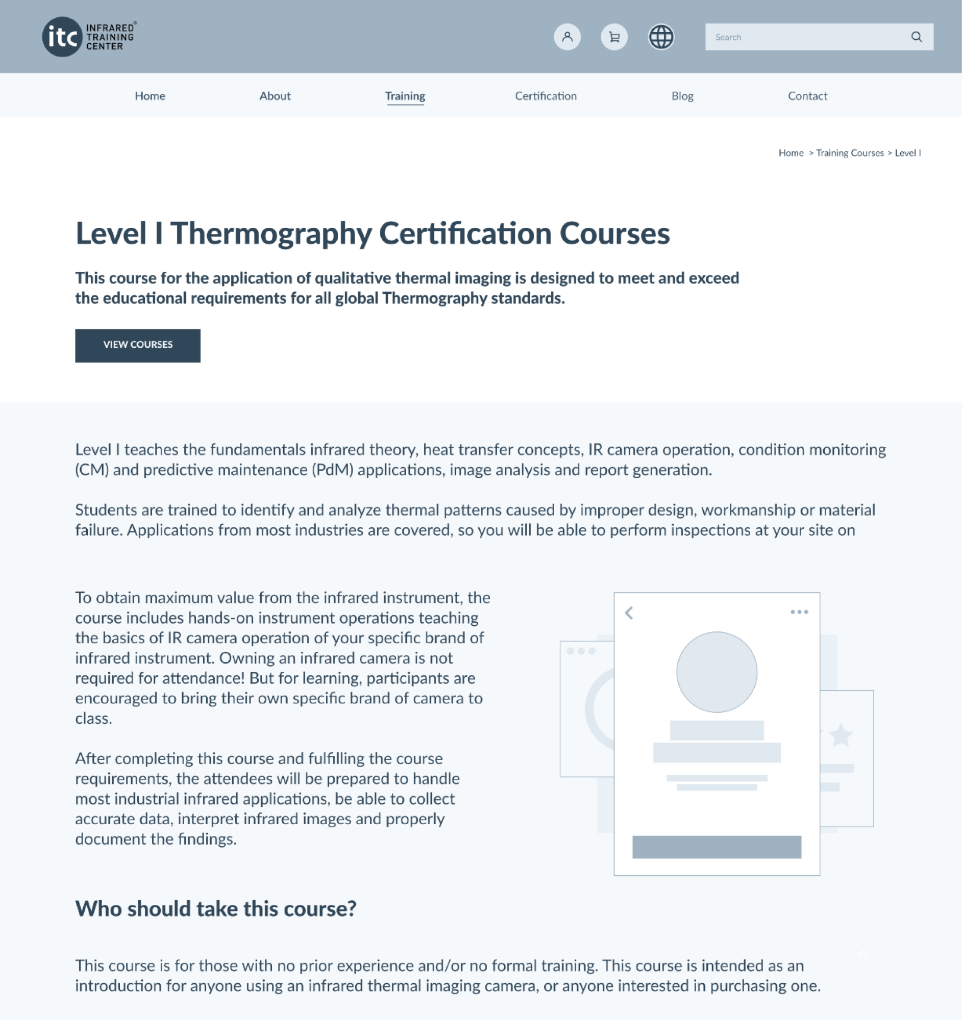
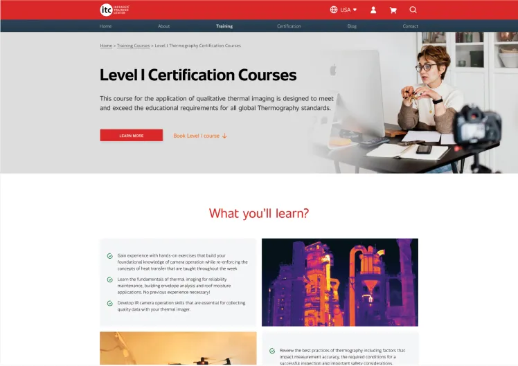
We crafted a UI kit with airy layouts, bold typography, and meaningful icons to bring order to a complex experience.

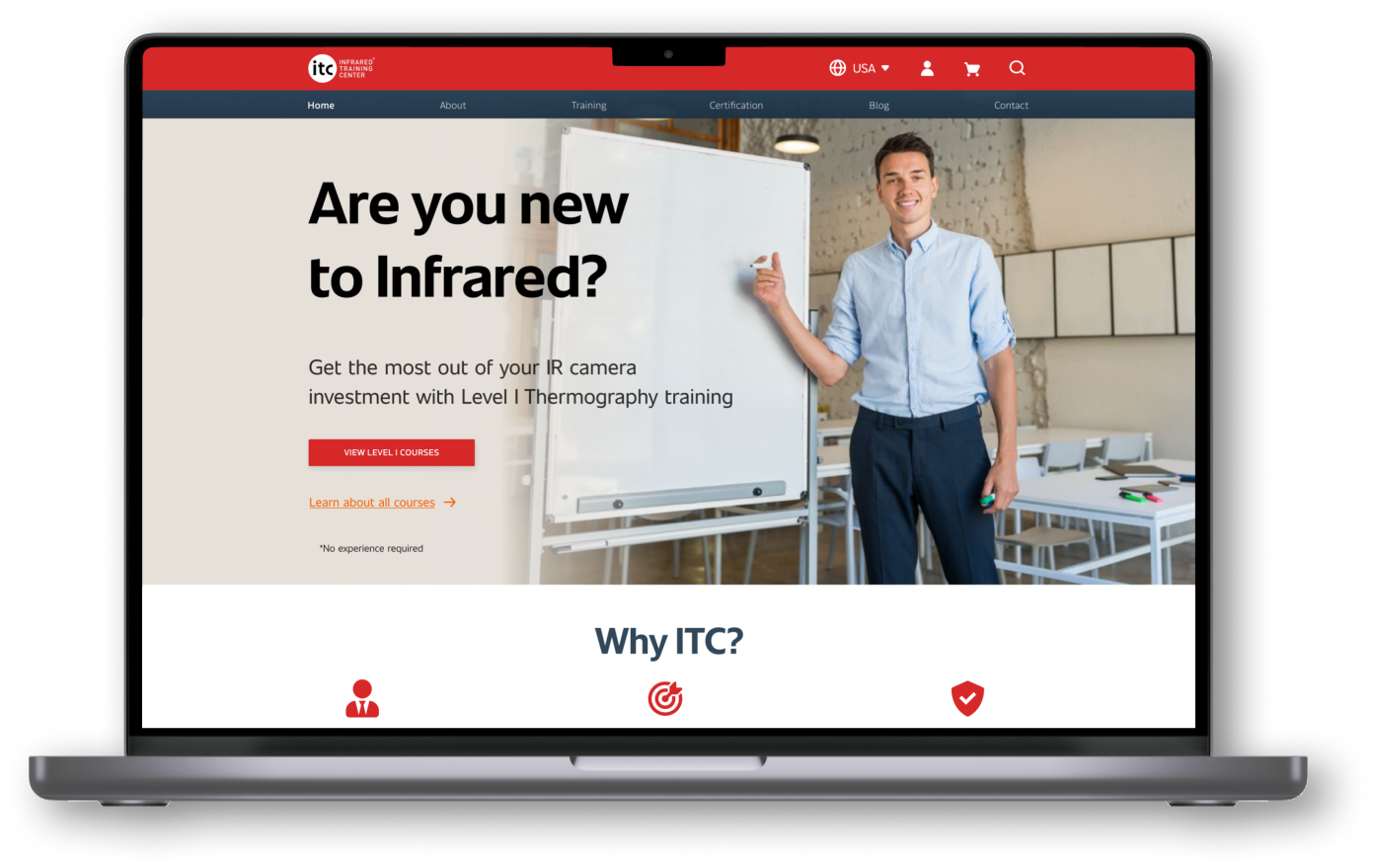
Landing & search pages

Clear navigation and structured filters help users quickly find the right course.

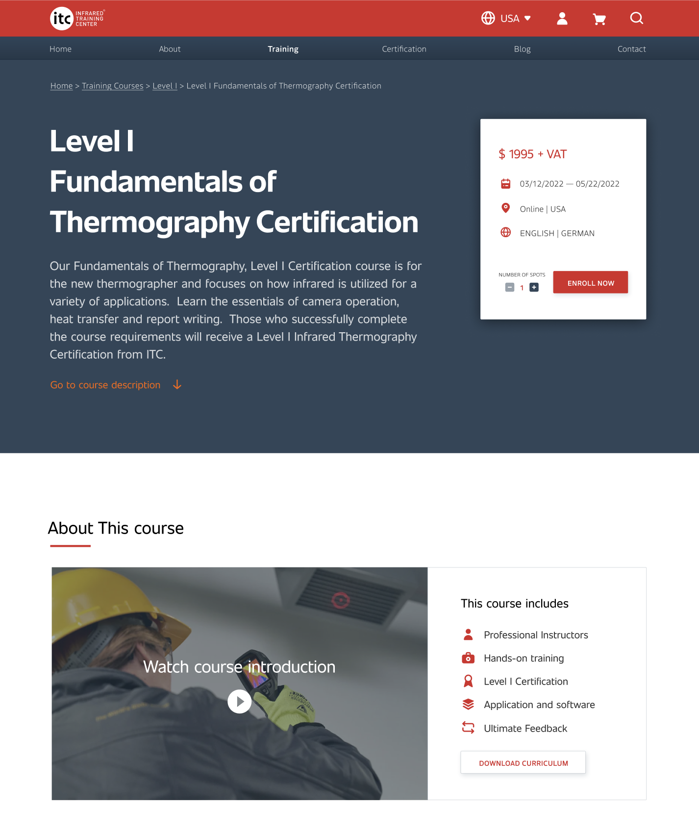
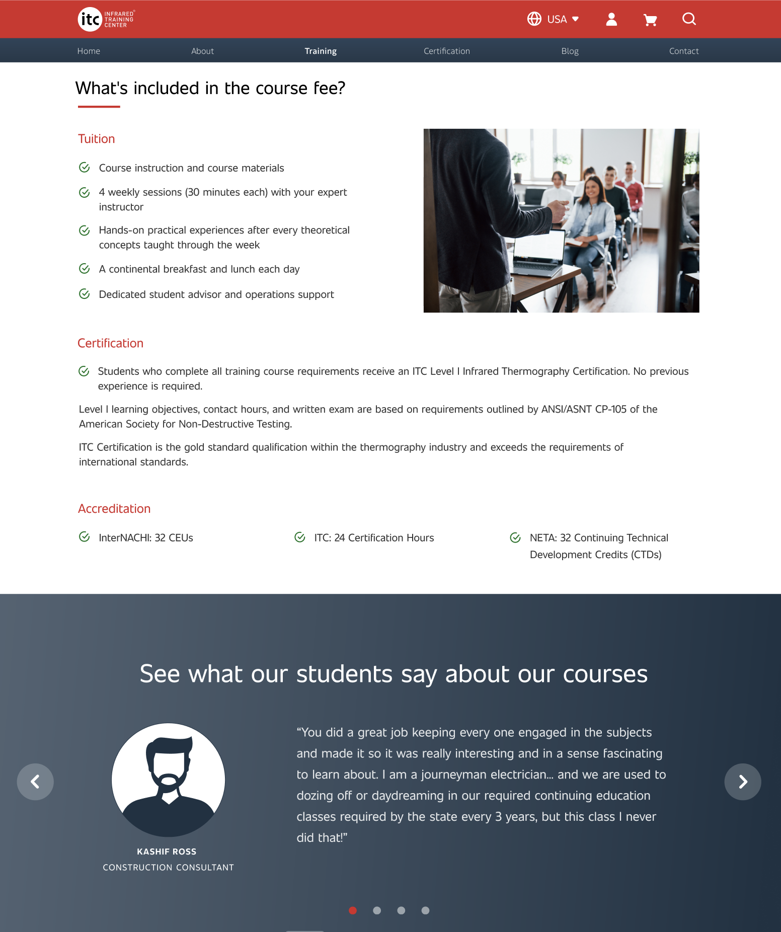
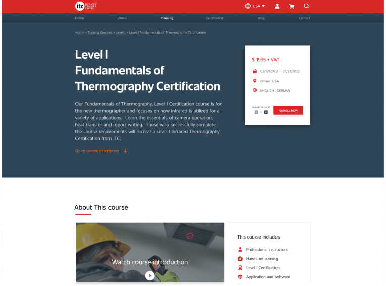
Product pages

Poorly designed product pages can confuse users, causing abandoned purchases or wrong selections, which erodes trust and increases returns.

  • Simple, readable layouts with ample white space
  • Descriptive titles, concise info, and clear “Add to Cart” actions
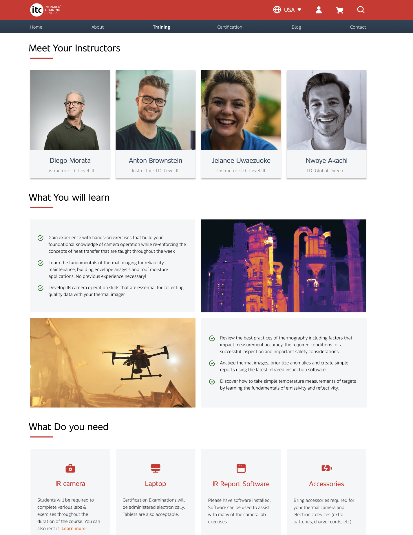
  • Videos and downloadable curriculum anticipate questions and save time
  • “What’s included” and testimonials build trust

The result: a visually calm, intuitive interface that guides users confidently from discovery to purchase.

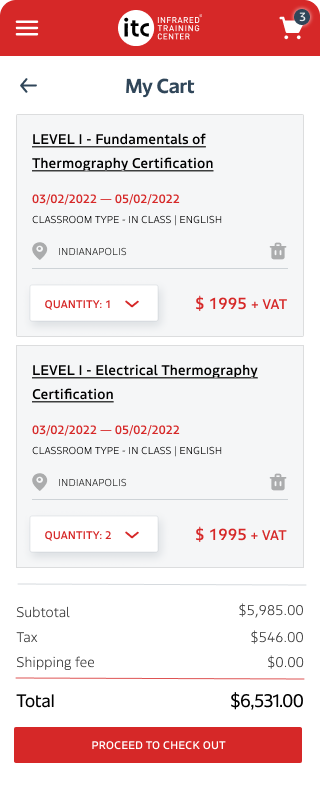
04. Bulk Buying Checkout

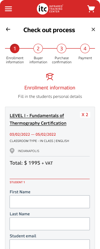
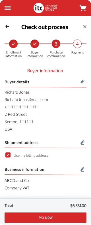
Complex bulk purchases for teams were slowing users down. We simplified the flow into four clear steps with familiar layouts and pre-populated fields where possible.

We pre-populate information wherever possible, including a “Buy for Myself” shortcut to skip redundant data entry. (Guest checkout cannot leverage pre-population.)

Finally, the success screen provides clear confirmation of payment, reminds users which email will receive the confirmation (critical when booking for a team), and includes a contextual FAQ to anticipate common questions.

05. User testing & iterations

Turning feedback into measurable improvements

In the second round of usability testing, we evaluated the redesigned booking and checkout flows to measure clarity, engagement, and efficiency. Users interacted with high-fidelity prototypes representing the new experience.

Key feedback

“The process was very easy to understand.”
“Make the big block of search fields shorter, or even hide it completely and put up an ‘Advanced Search’ or ‘Filter Courses’ button… much quicker to just scroll through the list.”
“People usually consider courses as something boring… I would suggest to make this site more fun—fight that feeling.”

Design iterations

Testing surfaced valuable insights into visual engagement, readability, and form efficiency.

  • Simplified search experience – Condensed the filter area and introduced a collapsible “Advanced Search” to reduce visual clutter.
  • Enhanced visual appeal – Added playful yet professional iconography and subtle animations to make the interface more engaging.
  • Polished flow clarity – Refined page hierarchy and interaction states, resulting in smoother navigation and higher completion confidence.

Outcome

Users found the redesigned flow intuitive and visually inviting. The majority completed tasks without guidance and described the experience as “easy to understand” and “refreshingly simple.”

07. Continuous Improvement

The onboarding experience redesign was just the first step. Using the MoSCoW framework , we implemented an incremental roadmap focused on:

  1. Post-launch optimisation – accessibility audit and analytics tracking to pinpoint drop-offs and high dwell-time pages.
  2. Customer support redesign – adding chatbots, knowledge bases, and multilingual FAQs to reduce support costs.
  3. Content experience – refreshing the ITC blog to attract learners and showcase expertise.

An improved customer support user flow

While out of scope for this case study, I’m including visuals from the subsequent customer support redesign to illustrate the continued evolution.